Friday, May 08, 2009

In Defense of Hard Skills for Designers

The other day I was in a meeting in which evaluation criteria for developers came up; nice concrete stuff, like writing code that other people can read and modify, putting in comments, resulting bugs, etc. It made me pause and admire the local weather of that strange country. In my experience, it's vanishingly rare for an interaction designer, usability specialist, or User Experience professional to have such nice hard criteria applied in evaluation of their work. Far too often, we're judged on mushy subjective factors like whether some team likes working with us, or feels we're doing something valuable--often outside their expertise or range of view to make this judgment, but that rarely stops anyone. I have some stories about this subjective mushiness in my article in HCI Remixed, titled "Designing 'Up' in the Software Industry."

Why is this--sign of an immature field? evidence of double standards, for sure, but also imprecision of job role? Poor management, perhaps contributing?

I suspect it's related to the observation that many designers have trouble achieving credibility in their role. Scott Berkun's seminar for UIE on Why Designers Fail advocated working on "soft skills" over hard skills, such as learning ways to win friends and influence people via negotiation, diplomacy, and other interactional condiments.

Not to pick too hard on Scott - it's hard to disagree that people skills are valuable and most of us in the computer industry are weak in some of them - but I think it's generally NOT true that designers have sufficient hard skills. I think gaining and using hard skills are our best bet for being taken seriously in places full of skilled workers. Most interaction designers spend too much time in "soft" areas that can too easily look like matters of opinion to others, or overlap and sometimes threaten other existing professional roles like product management: user testing (which often looks like "anyone could do this"), observing people work and suggesting improvements to their tools, pointing out issues in existing products that could confuse users (heck, everyone has an opinion on that), scheduling and managing stakeholder meetings, writing requirements documents and functionality specs. Most of these activities are politically difficult, and don't make other colleagues drop in their tracks and say, "Oh, you're so valuable and provide skills we don't have!" As I pointed out in my HCI Remixed article, a common reaction to much of this work is, "Didn't we already know that?" Finding problems with software is relatively easy; creating solutions is not.

We can convey solid, indisputable value when we focus on creating concrete, skilled deliverables that NO ONE ELSE CAN MAKE. In economic crunch times like now, consultants hear this from the front line. If a client or potential client has someone on staff who can apparently do what they do, they're not a clear asset. Never mind that they have 15 years of experience doing it, if their value looks like primarily "opinion" or "process," it's not very convincing when it comes to opening the bank account.

Here are some of my suggestions for hard skills, that many interaction designers and usability folks could stand a more training in:

  • Technical prototyping skills: Flash programming, javascript/ajax, css, html site design, Flex, Expression. Use of the tools that are used by developers, at a basic prototyping level, is a solid PLUS, because you can make things that everyone can see are relevant to the end product.
  • Ability to make high quality visuals: Visual design training, skills with Illustrator, Photoshop, page layout applications, and other design tools for good looking mockups. Low fidelity may be useful and helpful with fast user testing and concept evolution, but you want to be able to make something your client or non-designer colleagues can't make. I know one case of a visual designer hired into an interaction design role because of the caliber of his mockups. Never mind how wrong this was for him and his manager eventually-- it got him the job to start with.
  • Data analysis: For user research, learn some solid statistics. Even just pivot charts! Maybe some VBA for automating actions in Excel. Eventually, data mining, increasingly important with the large amounts of data around. (This is a career growth area all on its own right now.)

I'm with Scott that it's not a highly valuable proposition for a usability engineer to learn to do a cognitive walkthrough when they already know how to do 5 other methods for usability evaluation. But that's the wrong "hard skill," in my opinion. One who learns to make beautiful designs, which no one else could have made, will have a serious edge in their job role. Same goes for other skilled, niche deliverables. True story: A client with a budget problem told me recently that she had people in-house who could do an InDesign layout project, and that my value to her was in the data analysis and recommendations I could deliver for her that no one else could do. Good thing I'm working on that array of hard skills!

If only the university programs for HCI, UX, and usability thought like this, designer credibility issues would start going away a little faster. And performance evaluations for more designers could be done in concrete terms like how much good stuff we MADE during the design process, not how much we talked in meetings and if the other people there liked us when we did.

Labels: , ,

Sunday, March 29, 2009

So You Need to Do a Usability Test... But the Product So Obviously Sucks.

Most of us in interaction design jobs have been asked to do a usability test on something that we don't think is ready for prime time. You think it needs some design work before it even gets to users. The usual scenario is that your company or client is unwilling to listen to another stakeholder with design opinions (yours, or your team's), but will believe it coming from users. Either that, or they don't know what design is yet, but do have an idea that usability testing is a good idea.

Some strategies for turning this to your advantage, if your ultimate goal is being involved in the design, not the evaluation:

  • Make it a test that's just Pass/Fail. Don't allow room for wiggling on the results, or you wasted your time getting them data they don't want to hear. Agree up front on what this thing is supposed to support, scenarios they think it has to handle, and be firm on delivering the news afterwards. It's too easy to get wishy-washy about informal usability testing, and leave room for argument, otherwise.
  • Create alternate designs for use in the usability test. One of the best ways to educate the organization about the value of design is to DO IT. And to turn the test into an evaluation of multiple designs will help build your credibility and turn post-hoc evaluation into formative, and more useful, usability testing. Throw in some mockups at the end, or at the start, and ask for comments on those in comparison to the product that so clearly has problems, from your perspective.
  • Write the report before the test. No, not as unethical as it sounds - you won't deliver it, but you're checking on your skills to predict what's going to be hard to use. So, you got all worked up about how this thing is hard to use, for obvious reasons; now check to see if you were right! Better yet, have more than one person on your team do their own reports, privately, before the test, and seal them up. Afterwards, see who was the best at predicting the disaster. Chances are, the users will fail in ways never imagined (thanks to Kevin Berni for this line), and you'll be a little less cocky next time this situation comes up. But if you get it all right, you're building your case and confidence for pushing back on this kind of request next time around.
  • Ask others in the org to predict what might cause the users problems in the current design before the test. I used this tactic once when a QA organization felt the way I did about the usability of the product we were testing. I gave an award to the person with the most accurate prediction of user difficulty after the analysis. You want everyone in the company to know who has good insights into design and usability, right? People with good instincts need to be making the judgment calls, in the future. And you need to be able to illustrate that not everyone's opinion is equally valuable when it comes to making design decisions. Design insight requires talent and skill. This contest before the usability test helps identify talent-- skill development can come later.
Again, the only way you'll get involved in the earlier stages of design is if you show you can do that part, and what it entails. Make alternatives, and show why they are better. Next time, you'll be at the table for that part of the job instead.

Labels: , ,

Saturday, January 10, 2009

Animated Drawings (and Meta There-upon)

Today I ran across a whole class of items that are oddly similar, in different places: drawings animated, in not your usual way.

First, "Notebook," a video of a world in which paper and books are computers, in unexpected ways. What you draw is what you click on. It's more art than engineering, and I like the whimsy, especially the toaster.

Second, a wonderful new game you have to play to fully appreciate. CrayonPhysics Deluxe is remarkable. The demo video might look too good to be true, but it really does work exactly as shown, and I found myself grinning a lot as I played. Great for kids and casual gamers like me, it's forgiving, mellow, and can be played in short chunks. And I'd rather be playing it right now, to be honest! (I gather the iPhone version is not so impressive. You really need to be able to draw and immerse yourself in the screen world for this.)


Crayon Physics Deluxe from Petri Purho on Vimeo.

Last was a video I re-ran across while looking for some tips on animating stick figures. I pretty much stopped wanting to animate stickfolks after watching it: in case you haven't seen it, it's Animator vs. Animation. The sequel (Animator vs. Animation 2) is even more extreme, because the stick guy takes on the entire Windows OS. Satisfying!

Labels: , ,

Saturday, December 06, 2008

My (Renewed) Love Affair With Amazon: Video and Kindle Books

I remember when people sniffed at the idea of Amazon being more than books. When Jeff Bezos reinvested all his profit into opening up other shops, people said, "Diluting the brand?" and other naive things--I might have been one of them.

This week, I looked at my credit card statement and realized they were getting a bunch of my money. More than the usual regular book purchases for work and play. And I wasn't unhappy about it. I had a warm glow when I reviewed my charges for movies and other digital downloads. Amazon has become my main digital content provider. Other people are buying from iTunes more, but I'm a movie/TV/book girl, and Amazon has me covered right now!

I got two pieces of gadgetry this year that reinvigorated my love affair. The first is the Tivo Series 3 (HD), gotten in expanded and discounted form from WeaKnees.com. (Another highly recommended company with good service, by the way!) As you may know, I was a TiVo UI designer way back whenever (version 2) and still own stock and love for most things TiVo. The Series 3 works nicely with my Verizon FIOS which feeds me good bandwidth and HD TV.

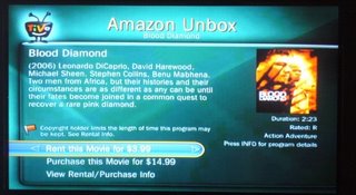
Back to Amazon. The other day my cat unplugged one of my TiVos and I missed an episode of Chuck. Remember the days of looking for friends who recorded stuff? I could've found it online in various ways for free, but it was convenient to just browse for it on Amazon Unbox via the TiVo, from my couch, and order that missing episode just like that. Worth the $2 for savings for my time and hassle.

Early in the year, I cancelled my Netflix subscription which I was never using, because of Amazon Unbox. I don't want to watch video on my PC, either. Now that Netflix and TiVo finally get their act together on streaming, I'll probably check that out over the holidays and see what it's like in terms of content amount and quality of streaming experience.

Gadget Two: This year I also got the Kindle, Amazon's ebook reader. In a year in which I got a new GPS, a Wii, an Ipod Touch, an eeePC, a new laptop from Dell, and a treadmill - this is hands-down my favorite new toy. Especially since I did a lot of international travel this year. I love that I can bump up the font, and read it in bed one-handed. The physical industrial design has gotten a lot of internet flack, but it does what it needs to do just fine. The book and blog experience are terrific, especially for fiction and feeds without too many pictures and long articles. (Pictures don't render fast or well on the b&w e-ink display.)

A typical Kindle set of experiences, which I can personally vouch for:

  • A list of Best Books of 2008 from Amazon editors' top picks -- I'm not so convinced by some of the capsule reviews, but hey, I'll send free initial chapters to my Kindle to check out! In a couple clicks, I've got 8 books to try out.
  • I read and like the first few chapters of one, so when I get to the last Kindle page, I click on "Order this book now." It checks that I'm not making a mistaken click, I confirm, and it downloads in seconds. Hooray! No regrets.
  • Make to Stick keeps getting good press among recent business books. I'm not willing to take up room on my increasingly groaning shelves if I can get this by Kindle - and yep, I can! Sample checks out as actually interesting, I can now read it as one of my background non-fic reads.
  • A friend recommended the Dresden Files books; earlier this fall I got hooked on the bad but addictive Twilight series. These literary wonders-- and more importantly, their sequels-- can be had by Kindle without driving to a store or waiting for mail to come. One click from a late night bed and I can keep reading.
  • I owned The Diamond Age in paper form but did get around to reading it. It's long and the font is small. You know what -- I read it by Kindle instead, since the font can be jacked up to a more reasonable size and carrying it doesn't require muscles. I also own the wonderful Jonathan Strange and Mr Norrell in hardcover, all 1000 pages of it. I will not have to carry THAT around again, I'll be able to read it on the Kindle next time. Er, no, it seems I can't yet - so I'm clicking that link on the left side of the page requesting it be made available by Kindle format. Same for Foucault's Pendulum!
  • I can't keep up with long blogs, or most blogs anymore. But I sure can read Cognitive Daily and MIT Tech Review and a few others by Kindle, when I have a spare minute for the short stuff.
  • Cory Doctorow and a number of other writers are making free ebooks available for their stuff. Cory's "Little Brother" got raves this year. I loaded it on my Kindle by USB cable.
  • Fanfiction - in a moment of weakness on a business trip, I started reading fanfic again, after a few years off. I can send PDF's and Word docs to my personal Kindle address, without having to even plug it into my computer. Yeah, I suppose you could use that feature for something worklike, too. It's unfortunately convenient. There is a LiveJournal community all about this fanfic-on-Kindle habit.
  • I like switching between genres and books and being able to bookmark pages, save clippings for later blogging, etc. I used the "lookup word" function a ridiculous number of times while reading The Diamond Age. It was all that Victorian English.
  • I don't love the web browser "experimental" functionality - it's slow by phone WhisperNet, but it will do in a pinch! I can read my twitter feed on it. I once settled a discussion of what the male version of "ballerina" is using my Kindle from a wireless-free zone of Northern Maine on a bird watching trip.
  • Tom Disch, a poet I liked reading on LiveJournal, killed himself this year. In a sad weekend, I copied and saved all his journal poems into a Word document and loaded it onto my Kindle. Now I can kind of keep him around.
  • Free ebooks... Manybooks is one site, and if you load this Feedbooks guide, when you click on any of the contained book title links, it will automatically download the whole thing to your Kindle. I got myself a bunch of old Rafael Sabatini adventure novels for one trip this way.

I could go on. The Kindle has something to do with me starting to read a lot again, like I used to as a kid. There are some minor negatives, like slow page turning (I would NOT use it for holding reference books), but nothing that overwhelms the good. I still order paper books, and always will; but I have a house busting at the seams with bookcases, and carrying them around isn't always convenient.

The combination of a very long battery life, and small form factor, WhisperNet with excellent Amazon shop experience and sample chapters, make the Kindle way more than the piece of white plastic a lot of people dismiss rather easily. I wouldn't get a Kindle if you expect great web connectivity, a multi-app computer experience, or a backlight... but get it if you read a lot of popular books, and especially if you travel a lot.

In sum, Amazon can take my money, for books and movies. Thanks, Amazon!

Labels:

Sunday, October 05, 2008

Pixar on Successful Creative Teams

I've seen this on a number of sites now, but it's rich enough to keep passing on. Requiring payment from HBR, the article is How Pixar Fosters Collective Creativity, by Ed Catmull. Some of his points are business management truisms or even cliches, but as with most management-related things, it's not the concept that's tough, it's execution that's tough. Especially in a creative environment.

On People. Most of his points here are about handling diversity and collecting lots of input from lots of sources. Less dictatorial hierarchy, more feedback and empowerment of teams to decide how to handle the feedback. Some good quotes:

  • "If you want to be original, you have to accept the uncertainty, even when it’s uncomfortable, and have the capability to recover when your organization takes a big risk and fails. What’s the key to being able to recover? Talented people!"
  • Creativity isn't about finding one big good idea. "However, in film making and many other kinds of complex product development, creativity involves a large number of people from different disciplines working effectively together to solve a great many problems."
  • And yet, talent isn't evenly distributed, he acknowledges. But this does not mean anyone tells anyone else what to do - a creative team gets input and makes its own decisions about what to do with it. A "brain trust" of the truly excellent people with track records can be called on for input when teams need help, but they don't dictate anything. Ironically, this frees everyone up to talk and listen more effectively.
  • Having talent on staff isn't enough. "What’s equally tough, of course, is getting talented people to work effectively with one another.That takes trust and respect, which we as managers can’t mandate; they must be earned over time." If people trust each other, they can be less polite in meetings, apparently. Ideas are under discussion, not personal status and power.
  • "An important lesson about the primacy of people over ideas: If you give a good idea to a mediocre team, they will screw it up; if you give a mediocre idea to a great team, they will either fix it or throw it away and come up with something that works." I note, they can only do the latter if they are given the freedom and authority to do something radical.
  • Pixar's "small incubation teams" that consist of a director, a writer, an artist, and storyboard folks. Whereas in my experience most software incubation project teams are weak on the creative staffing and very heavy on the implementation side, not a good balance of skills for the stages of creation.
  • It's critical for an incubation team to function well internally: "During this incubation stage, you can’t judge teams by the material they’re producing because it’s so rough—there are many problems and open questions. But you can assess whether the teams’ social dynamics are healthy and whether the teams are solving problems and making progress. Both the senior management and the development department are responsible for seeing to it that the teams function well." I note: presumably there are non-subjective, non-gossipy ways to evaluate social dynamics. I've seen this rhetoric applied to very bad ends at one company.
  • Catmull says, "Treating one another as peers is just as important as getting people within disciplines to do so. But it’s much harder. Barriers include the natural class structures that arise in organizations: There always seems to be one function that considers itself and is perceived by others to be the one the organization values the most." Overcoming that is a huge management and process challenge... Catmull seems to be saying that time together helps, but I think the deliberate creation of well-rounded incubation teams is a big aid in changing these biases. None of this "we'll add a user interface designer later" stuff, like you hear from the software company incubation teams!
  • Newcomers to an organization can be threatening, because of the "not invented here" syndrome that they may cause with their new ideas. But constant change, not taking success for granted, and acknowledgment of mistakes made can make newcomers less threatening to current employees, he says.

On Processes. So they've got a good staff who encompass both technical and creative backgrounds, now how do they keep it all working and on track?

  • Dailies are watched, by lots of people (the animation industry version of footage of the day). Sharing unfinished work and inviting comment helps creatives get over the fear of showing the incomplete, and that in turn means work isn't wasted if it's on the wrong track. I note, a healthy culture of regular software design critique does not exist in most software companies (barriers to this are a political subject for another time). Agile development processes seem to be better off in this regard than waterfall-like models of development: producing and showing in-progress work is critical in that methodology.
  • Input on work-in-progress is collected widely, because the work needs to be great before release to the real world. TiVo executed on this principle when I worked there, too; employees all used the beta software at home and we had to like it, too.
  • Post-mortems are done regularly. Rather than just "what went well and what didn't go well," his suggestions include having groups list the top 5 things they'd do again, and the top 5 they wouldn't do again. Now, in a creative environment, people often assume that you can't evaluate the creative process. But Pixar uses data to ground the post-mortems (making me wonder how they track it, who does the analysis, etc). "Most of our processes involve activities and deliverables that can be quantified. We keep track of the rates at which things happen, how often something has to be reworked, whether a piece of work was completely finished or not when it was sent to another department, and so on. Data can show things in a neutral way, which can stimulate discussion and challenge assumptions arising from personal impressions." The fact of being "neutral" prior to interpretation is important, from my perspective. Using data in a post-mortem shouldn't lead to finger-pointing so much as conversation about root causes for data peaks and valleys.
  • Management challenge for their corporate processes: "Clear values, constant communication [across and around hierarchy], routine postmortems, and the regular injection of outsiders who will challenge the status quo aren’t enough. Strong leadership is also essential—to make sure people don’t pay lip service to the values, tune out the communications, game the processes, and automatically discount newcomers’ observations and suggestions." And I say: Easier to say than to execute. Leadership is so rarely evaluated well, at any company.
  • Catmull says they keep up with academic research. Being cutting edge means staying on the bleeding edge, and being able to attract people who want to work on that edge, too. Why do so many companies sneer at research and research conferences?

It's a good article, and I think worth the $6 cost. It does leave a few questions I had unanswered, like how they handled the massive overtime and repetitive stress injuries he describes during one "failure recovery" period.

As a final point, something I've said here before: Post mortems may be unpleasant, but understanding how a team was successful is just as important, or more so, than understanding how it made mistakes. I don't think most companies use the positive particularly well in setting up their downstream teams. I think Pixar probably does, to have such a string of successes.

Labels: ,

Thursday, October 02, 2008

My Twitter on the VP Debate

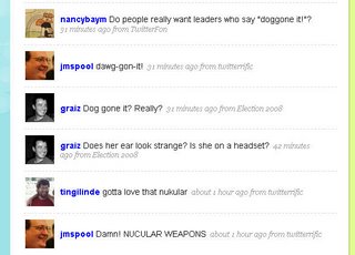
I couldn't watch it all, and made a mistake in not having my twitter in front of me while I did. But here's, in a glance, a big reason I love twitter. There's a slim chance that 2 of these people know each other, but I don't think the others do, although I bet they'd like each other if they met. (Assuming they won't mind: tingilinde whom I know from Bell Labs/AT&T, Nancy Baym from grad school mentorship days, Jared Spool from being, well, Jared, and Greg Raiz, a colleague from Boston.)

Labels: ,

Sunday, June 15, 2008

Let Your Designers Design!

We all know now that good design is a crucial element in a crowded market. But just because people in your company have strong feelings about design, doesn't make them good at it. Some of their ideas may be good, but that doesn't make them good at executing either. In the worst cases, they both think they have good ideas and think they can execute, and they can do neither. (Remember, incompetent people don't know they are incompetent.)

Signs of the problem in your org:

  1. You have designers on staff, but they're demoralized and frustrated. Designers are a special breed of person, more likely to leave when they can't accomplish what makes them tick than many others; they're driven by their skills and talents more than promotion opportunity inside a company or a domain in which they work.
  2. Consensus-driven culture has ground projects to a halt. You can't break out of decision-making meetings with a clear goal, and there are too many cooks involved. Because the designers aren't empowered to make the final design decision, and other (incompetent) people are weighing in or fighting with them. (See Scott Berkun's recent take on this, and an old take on why products don't end up usable that covers all this organizational stuff too.)
  3. You may have a lipservice executive level belief in design as important (ever since Apple made it profitable), but you have no headcount for it, and no org process for it. There are no goals in the marketing pipeline that focus on it, there are no metrics to measure it, and it's no one department or person's job. It's handled diffusely, and not managed effectively.
  4. Secretly, you or other middle-level managers think design is a technical thing, or the "fun" part for the technical folks, and it's best handled by developers as a kind of prize for the good ones. Don't bother trying to hire in this climate!
  5. Final decisions about what gets in the product and what's shippable are based on criteria or opinions that don't know much about how customers respond to your stuff. Bugs that in a one-in-a-million system configuration cause a crash are prioritized about correcting a layout problem that makes you look amateurish, or a typo that makes you look like a busload of idiots.
  6. You think it's all about the documentation - the customers just need to read more.
  7. You outsource all of your visual design, and that's what you mean by "design" anyway.
  8. You didn't realize people get degrees today in usability, human factors, interface design, interactive design, etc. In these degree programs they learn the correct ways to collect and interpret data, deliverables that communicate at different levels of fidelity, how to go from abstract to concrete, how to validate designs, and how to prototype. Corollary: You also think design is work that's "obvious" and easy, probably also because it doesn't involve writing (much) code.
  9. You don't have actual project managers on your staff. You make it someone else's job, usually a development manager's; this means design as a phase and design deliverables are not scheduled and monitored in the way that code production is. Instead, it's all "where's that damn spec, we need to start making this thing."
  10. Your designers are actually trying to steal the project management, so they can get some control over the process, but this is leaving them too busy to actually do design. They schedule meetings to get stakeholders together, they try to get the PM's to articulate what the heck the requirements are, they hire visual designers, they call customers... they never actually get to design, except after hours.
  11. You've got innovation projects going on in your company, but there aren't any designers working on getting things right from the start. (Chances are, they are too busy with 9 and 10 to be contributing even if invited.) But basically you feel that design is "icing" to make it look pretty after the big ideas are implemented. You think the real breakthroughs come from technical ideas, not ideas that come from watching people work or new interaction techniques or novel workflows. Never mind how expensive it is to get requirements wrong up front and have to "fix" things later. (There are any number of software studies on this, drop me a note if you want refs. I've seen startups go under from this, before they even got out the door with their product.)
  12. You've got internal folks like usability testers who are told they "facilitate" group processes but aren't empowered or able to make overruling design decisions. This is explicit support for consensus design or committee design, dangerous when everyone else is opinionated but incompetent.
Okay, I admit it felt good to get this list off my chest today. It's not the last time you'll see the subject cross this page. Let's hear it for design moving up the org chart; and for middle management and technical management understanding there are skills that might help with product big picture and end-game success!

Labels: , ,

Saturday, May 31, 2008

Mandatory Post on Twitter: A new form of MUDding?

Everyone else is doing it, so I'm posting about Twitter too. I admit I've been enjoying it, probably more so since I have less time than I used to for blogging, Bloglines, and keeping up with friends on LiveJournal.

Everyone who writes about Twitter has to compare it to other things. For me, it's most like what we did in MUDs when I used to hang out there (a kind of chat world, see MUDs and MOOs on wikipedia, and my book about one). We used to connect while working, and "idle" much of the day, but "wake up" to post links to things we thought were interesting, or to say what we were doing "in real life." We even watched TV together in a MUD group. In a MOO, you had to do something special to direct comments to someone, just like you do in Twitter (where you prepend "@name"). Voila, c'est Twitter; except that in a MUD you had to go somewhere to be in the space by connecting specially, it was less public, and a lot more synchronous. Plus not searchable from "outside" the MUD client. So, okay, it had some differences.

Other things it's like: How people change their "status" message in a chat client, and sometimes riff off other people's status messages. That's not archived in the way Twitter history is, though. And it's like SMS, in that's it's terse, but for a party. And it's like a very slow chat room, where no one really knows who's listening in or who might look at what you said later. (Watch out.)

Brief geeky research aside: There's an old paper by Clark and Brennan (1991) that's a goodie among people who study CMC (computer-mediated communication) that describes potential aspects of communication media, including whether they offer co-presence, visibility, co-temporality, and sequentiality of messages. To really consider how Twitter stacks up, you would also want to consider system features that characterize rich Internet communication tools, such as the potential for users to have private one-to-one and multi-party conversations that aren't recorded, what kind of message size is possible, availability of threading/sorting/filtering tools, ability to archive exchanges and/or prevent it, possibility of editing posts after they are made, ability to block messages from certain people.

Twitter is less synchronous so less co-temporaneous than internet chat or face-to-face or phone talk, the reviewability is possible but only fair in practice (in that you have to do some work to go back in a history to check what you missed), and interruptions between two-person exchanges are common. Threads are possibly even impolite. Private messaging is possible depending on the client used. Editing isn't possible after posting, but deletion is. The message length constraint strongly restricts the type of exchange that can happen, by design. Blocking of a kind is possible. You can filter your list of followed people to a "favorites" list if you want.

Which reminds me - all communication media allow for genres or registers of speech/writing, in which the style and topics can differ tremendously across groups of users and occasions of use. Generalizations about how people use Twitter will only be applicable to local groups of followers and their following. So I won't try. Give a look in and see what you think.

Because of the very public nature of Twitter, we get the possibility of search tools like Summize. Which means you can look up keywords or people and find out what's up with them. You can even subscribe to these searches by RSS, so thatt you can follow public chat that mentions your favorite product or TV show. (When I mentioned FIOS once, someone who works at Verizon started "following" my comments on Twitter.)

Summize also allows for interesting meta-search applications like Twitter Spectrum, allowing you to contrast word environments for two terms. Just for fun, here's a few charts of contrasts I find interesting. You can see who's talking more about what here.

Anywho, I'm enjoying Tweeting, although I still miss ElseMOO after all these years.

Labels: ,

Tuesday, May 06, 2008

Mini-UPA conference in Boston

Boston's mini-Usability conference is coming up on May 28 at Bentley. This is a reasonably priced one-day event that attracts quite a local crowd, and not a few non-locals. I had a good time at this last year, when I was a speaker on online community design. This year I am speaking about life as a consultant, and mistakes I made in my first year. Here's my abstract:
One year ago, I quit my job and started consulting full-time, after 10 years of industrial wage slavery. I was financially successful in this year, but made a lot of mistakes. I managed to fall into bad headhunter relationships, make mistakes in my accounting that required a 101 class to fix, became thoroughly confused about whether to be incorporated or not, and generally made a lot of newbie mistakes with a handful of clients ranging from garage startups to established software firms. Other local consultants gave me advice and I learned from my mistakes. I can tell you how I did it and what I could have done better; and how it compares to what other local consultants say. I will cover:
  • Your use of the internet to advertise yourself (search engine optimization, job sites, Linked In, blogs, etc.)
  • Portfolio work
  • Branding (logo, name, etc.)
  • Proposals
  • What to charge (the many factors and equations; plus: "they're charging WHAT and someone is really paying it??")
  • Headhunters and job offer pressures
  • Basic accounting and expenses to track
  • ... And other things I learned the very, very hard way, like the portable office equipment it might be nice to own because the client site is a cave with rocks to sit on.
You'll get a handout with the Top 10 Most Important Consulting Considerations in case you too want to do this!

BIO:Lynn Cherny has a Ph.D. from Stanford that she hasn't used in years, except for some statistical skills. She has 12 years of experience working at and/or managing interface design at companies including TiVo, Excite, Adobe, The MathWorks, and AT&T Labs. Her current consulting identity is Ghostweather Research & Design, LLC. She can be reached at lynn@ghostweather.com.

There are interesting names on the list of speakers, including Jared Spool and Chauncey Wilson, Beth Loring and Joe Dumas, plus a host of other local employers. The talks range from research methods to design case studies, with a bit of business thrown in (thankfully, for some of us!). It's even multi-track, reflecting how many submissions they get. And their cocktail hour is fun and well-stocked.

Labels: , ,

Sunday, April 27, 2008

NASA Tech Briefs: Create the Future Contest Awards in NYC

New York City, April 2008: In New York last week, the Create the Future Contest award winners were honored in a nice ceremony. The awards were presented over a swanky dinner and drinks at the Water Club in NYC. (Good thing I changed when I got there: a classic NYC taxi driver let me off early saying, "I can't turn right here. You have to cross there and go under that overpass, past the helicopter landing, and then it's on your left.")

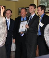
While I was pleased for all the qualified entrants-- almost 1000 this year, a record probably due to having a website -- I was most happy about the two student category winners. Jeremy Connell, a junior in Virginia, actually used SolidWorks for his cargo carrier design. Here he is holding the paper edition of NASA Tech Briefs, which features his winning design on the front cover! Jeremy Connell at NTB Contest Jeremy would like to get a job designing boats. I'm also hoping he'll intern at SolidWorks if he's available and we can work out the details.

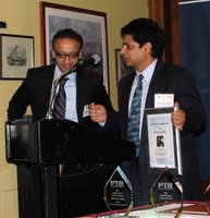
The winner for the Transportation design category was student Corban Tillman-Dick, who is actually an economics major at Johns Hopkins. He's the designer of a more efficient engine, the Internally Radiating Impulse Engine. His brothers were all present for the award; they are trying to get funding to base a company on this design. Sadly, their father, who helped with the design, died suddenly in a car accident a few weeks earlier and could not attend with them. Here is Corban and a brother with Jeff Ray, CEO of SolidWorks: Corban Tillman-Dick

A few other winners -- Joseph Hollman designed a beacon locator for mine workers, shortly after a serious mining disaster last year. Here is Joseph receiving his award: Joseph Hollman with award

And Dr. Ajay Mahajan and colleagues were there to receive their Medical category prize for a 3D ultrasonic neuronavigation system for realtime image guided brain surgery. Ajay Mahajan

I'm afraid my camera batteries, bought for €1 in a Venice shop, did not hold out long enough for everyone's prize.

As you may recall, I was the consultant that designed and project managed the contest site for SolidWorks. This was the first year that SolidWorks was a major sponsor, as well as the first year there was any website featuring visible entries (and featuring a frenetic, viral "page view contest" which galvanized many students, not to mention bots). Jeff Ray also accepted the SolidWorks award for "Product of the Year" given by readers of NASA Tech Briefs, entirely coincidental with the co-sponsorship of the Create the Future Design Contest. (Obviously the contest was not judged based on software used by any entrant, and SolidWorks did not participate in the judging in any way.) Instead of a boring talking shot of Jeff Ray, I like this pic of him talking over drinks to our student winner who used SolidWorks.

Apart from the chance to see the sometimes wacky but always creative inventions, I got a lot out of seeing young designers do so well in the contest up against professional engineers. And in general, there were a lot of ideas that could make the world a better place with the right exposure and funding. Providing webspace for inventions and inventors is a good thing for us to do. We'll (and I'll) be doing the site and contest again this year! Stay tuned for another June launch.

Labels: ,

Saturday, March 29, 2008

Business Week Top 50 is Out; Autodesk at TED

The "best performers of 2008" (already?) are up in a list at BusinessWeek Online. Despite what many (including BW) would call a recession, there were some healthy net incomes. Their interactive chart (sortable) is kind of fun; but in an interesting discrepancy, the sector identified for each company does not agree with their print mag's reporting, and this makes me a little suspicious of their rankings which were tied closely to sector identity. Apple (#6 this year) is called a hardware company in print, but IT online.

Handbag maker Coach is #1. Multiple good years for them. But skipping to the technology companies: Apple at 6, Cognizant Technology Solutions (an outsourcing consulting firm) at 19, Amazon at 23, Autodesk at 28, Google slipped to 34, and Microsoft is at 41. In companies not run by a white man in his mid-50's who looks distinguished and politiciany, we have just 2 women, at Avon (a company that got written up as having a "makeover" and looking "pretty") with Andrea Jung, and PepsiCo with the fantastic Indra Nooyi (Indian woman). I don't drink Pepsi because of her, but I like it better because of her.

How about that Autodesk, a company alma mater of mine! (Adobe wasn't there this year, but was last year on the strength of the CS3 release.) The writeup is especially interesting if you were there at Autodesk working on this area: "Autodesk's latest software makes architects and engineers more productive-- and injects visual oomph into their designs. Its new three-dimensional software, including Revit Architecture, lets architects model a building's face and sides in the same drawing. Even midprice PCs can run the programs, and that has expanded the [company's] market."

Autodesk had Revit (a local Boston-area acquisition) for many years, so it's hardly new. Midprice PC's are pretty peppy nowadays, so that claim may be true. For all the old-boy cronyism and management nastiness I thought it had, Autodesk does have a smashing smart CEO who cares personally about product design and usability, and now employs some of the best interface designers I've ever worked with (particularly from the Alias acquisition).

[Updated to add: Autodesk and Carl Bass were in form as sponsors at TED this year, with one of the Alias products making high-profile news too: check out how Alias's innovative Sketchbook Pro (rebranded for Autodesk of course) was used for the during-conference blogging report up at "Autodesk at TED2008". The Autodesk message is that they're about "design innovation" and sustainable design. Convincing with that great research and design team from Alias, for sure!]

Top 50 history: The BW Top 50 from 2006 (Apple at #1), and from 2007 here (Google at #1).

Labels:

Sunday, March 23, 2008

Netflix Contest and Recommender Systems (short history)

I'm fascinated by the Netflix challenge: Netflix is offering one million dollars for an algorithm to improve recommendations based on movie ratings. Along with this go intermediate "progress" prizes of $50,000 per year the contest runs. The prize leaderboard is interesting reading, in that you can see who is entering teams, their results, and sometimes a bit about the team. Team Bellkor is a group of researchers from AT&T Labs, my first employer out of grad school. (I don't know these particular folks.) Netflix provides an interesting example of one company "funding" research at another company. The research lab folks are getting papers out of it, of course, probably the most important thing they need to do in a research lab (money comes second; although these days, proof that their work can impact a real business domain may beat everything else).

In another AT&T Labs connection, the Netflix prize FAQ cites an excellent overview paper on evaluation of recommender systems (pdf), co-authored by a colleague of mine, Loren Terveen, from the HCI department I was in at Bell Labs. Loren worked closely with Will Hill, one of the Bellcore researchers who (co-temporaneous with Pattie Maes at MIT and Paul Resnick) kicked off the work on recommender and ratings systems that you now find implemented all over the Internet. Recommender systems as a broad theme include all user ratings on products or comment postings (such as Amazon book ratings, or ratings implemented in almost all forum software now); they're intended to help others find good quality content by aggregates of ratings from other users, not from editorial oversight which is costly and therefore scales poorly to large amounts of content. There are important tweaks you can apply to your system or your filtering mechanism, such as "ratings of people like me" versus ratings of everyone, of course. (Netflix has some version of predicted "ratings for YOU", specifically, which I haven't investigated in any detail.)

I recommend glancing through Loren et al.'s paper, for a refreshingly meta perspective on a piece of technology that now defines a lot of assumptions behind what is called "web 2.0." As a more personal note, I wander among mostly non-research types these days, and the hot topics du jour (like "social networking") tend to get dropped into web system design discussions all the time, with a kind of naive "of course we need it" mentality. I can only sigh at how old I feel sometimes. Critical evaluation and careful implementation do matter, even for all the stuff that made it out of research projects into profit-making companies and community-platform toolkits.

As another personal note, I'm generally pleased by the level of researchy savvy I detect in the Netflix prize FAQ. Hey, if you're hiring at a software company, consider investing in some serious research-minded folks for competitive advantage!

Labels: ,

Sunday, October 07, 2007

Search Engine Poetry Generator

I've always liked random poetry generators (I could dig up some of my favorites, but I'll save it for another day) -- so I wrote one based on an idea I saw on someone else's blog. (I admit their idea is more interesting, but I had a simple goal to start with: practice with SQL and PHP on my hosting server.)

My generator builds random "poetry" by stringing together keywords and keyphrases that hit my site from searches in the last month. (I'm afraid it's not a real-time feed from my logs, it's canned from the last month.)

Popular searches on my site: ghosts, Canada, and disorganized organizations. It makes for peculiar poetry, not good, but kind of fun. Victoria's Secret is definitely showing up more and more, too.

One of them:

alice in wonderland porn
   lost
  i need
  stone
  tivo patents

for me, illusion
   -- erin
Give it a try, or ten...

Labels: ,

Sunday, September 16, 2007

BostonCHI Panel: User Experience Organizations

There was a good cross-company discussion of organizational models for User Experience (UX) teams at Boston CHI on Sept 11 (check that link for full bios on the speakers). Companies represented by managers, directors, and VPs of UX: EMC, Oracle, Symantec, and Fidelity (with Sun and others in the audience).

Some themes that emerged:

  • Need to maintaining standards and cross-company guidelines requires having high level management or at least view that spans the organization — with creative org charts and management across sites often happening as well;
  • Difficulty getting enough staff to meet demand (settle instead on doing fewer things well rather than over-extending, and making the case for more people that way);
  • Organizations have more interaction designers than usability, by 2-to-1 or more (again, a separation of design from testing roles);
  • Assumption that "good user experience" is no longer something that has to be argued for, it's seen as an obvious competitive advantage (the only mild disagreement from Fred at Fidelity);
  • Engineering pay scale for their UX staff (common except for Fidelity, where pay didn't come up — since Fidelity hires a lot of low-paid contractors, I suspect they don't pay their internal folks by engineering scales ).
  • Get the design right up front, or pay for it later. Very broadly assumed to be understood here!
Less obvious themes that resonated from my past few years in the field as manager and individual:
  • UX people can get bored working on the same thing, or the thing with too small a scope. Being able to move across projects will help with this issue.
  • Not having to be accountable for all your project time means being able to do cross-product things and user studies that will improve design work downstream (it doesn't mean goofing off on long lunch breaks!).
  • Long-distance management working remarkably well with the right management attitude.
  • From Oracle, being responsible for good products, not just good specs (teamwork in an organization). [Adobe, while I was there, was terribly concerned with the checkoff that UI had delivered a spec on time and were not "blockers" on the product schedule; this was an ill of centralized UI management that wasn't very flexible in the development process or in terms of their deliverables on each team.]
  • Value of being managed and reviewed by people who know what you do, not being dependent on managers who don't understand your process, contributions, and work products.
  • Investment in prototyping and development.

Relevant past post on my blog: my study of the job postings for UX folks on the BayCHI mailing list for 3 years. Oracle, Symantec, and EMC are on the graphs, but not very high in terms of number advertised for relative to overall size of the company. Fidelity doesn't appear at all, but it hires mainly in MA, I believe.

I have a full report (albeit sketchy) from the panel and the questions posted here. Scroll down to get past this recap on the top!

Labels: , ,

Tuesday, September 04, 2007

Pavel's Puzzles

Thank goodness, just when I was dreading starting my post about strategy and tactics, Pavel Curtis gave me a good excuse to avoid it: he's launched an online puzzle shop! Since I'm currently reading the slightly evil yet fascinating The 4 Hour Workweek: Escape 9-5, Live Anywhere, and Join the New Rich which describes many such businesses, I'll be fascinated to watch his progress. (Updated to add: Here's his announcement post about it, on his regular blog.)

Pavel is not only a Lisp hacker with mathematical talents, ex-PARC denizen, and founder of famous online community LambdaMOO, he's a gentleman who co-hosts an annual games party on New Year's that attracts an interesting crowd. I went once attached to one of his invitees, and it was more fun than I would have expected, being your typical uncompetitive, non-gamer who freezes under public performance pressure. His and other puzzles dotted the house, I recall. That was back in the hills of Palo Alto, before the more recent Seattle move! We are all getting old and moving too often.

If you like puzzles with interesting stories, go help Pavel retire from the Evil Seattle Empire and become the new rich!

Labels: ,

Wednesday, August 15, 2007

Create the Future Design Contest: My Press Release

I am very pleased to be able to make my own press release for a project I've worked on the last few months, the NASA Tech Briefs Create the Future Design Contest website. The contest this year is co-sponsored by SolidWorks, a great company and my current client. The contest is open to all inventors regardless of their software choice, however!
Design Contest Graphic

Grand Prize is $20,000, and there are significant other prizes in the prize list, too. Plus, a great t-shirt if you enter with a qualified entry. (The contest image was acquired--legally--from the patently absurd inventions archive.)

The Create the Future design contest has been running for at least 5 years now. They regularly receive around 1000 entries. In previous years, the folks at NASA Tech Briefs handled this contest entirely on paper, which was a lot of work for them. There was no website featuring the entries, so the entrants had no idea what their competition was, and the public didn't get to play at all.

SolidWorks (and I) wanted to make the fun more visible and reduce the work for the NTB editorial team. So we've dragged the contest into, okay, about the year 2004 -- the site is pretty basic, was done on a shoestring dime, and next year will be a lot fancier and more dynamic. But I'm still very pleased at what we've done.

We wanted to help people who enter have a better shot at winning, too -- I emailed all the past year's judges and asked them what advice they had for entrants, and we got excellent responses. Anyone considering entering should definitely read the Tips page.

I was particularly struck by how important clear communication is in creating a good entry. Some example quotes:

  • One judge recommends: “Write at least 4 drafts of your presentation and have 2 or 3 people of various levels of understanding review it. This will provide for a presentation suited for the diverse backgrounds of the judges.”
  • "I look for a concise description of the design and ask, ‘Have I seen this before?’ and ‘Do I think this is useful?’ If it passes those tests, it makes it to the ‘for further review’ pile. “Then, I’ll look again at the entries I initially discarded and ask if they are trying to take something similar and existing to a new level. If the answer is ‘yes’ and the idea is useful, it goes on the final’ pile.”
  • “For models of good technical presentations, check out Science, Nature and other well-known technical periodicals. You’ll see a good cross-section of abstracts and structured papers. The contest emphasizes content, not structure—but in a professional setting, structure is important."
The CAD world has a tendency to think it's all about the beautiful image, but the text is enormously important in this contest.

Although the main prizes are awarded by the NASA Tech Briefs' invited judges panel, there are 10 prizes for the entries that most captured the public eye. You can help by coming to view them yourself, and posting links to the entries you particularly like. While you're looking around, try finding the guy who has a real beef with NASA (whoa), the personal cooling system, the strangely redundant (IMO) salt and pepper shaker. You may not be surprised by the entry with the current top page views -- apart from being a very cool idea, it's extremely well-written, too.

Help us advertise the contest and the best entries! And consider entering yourself. There's still plenty of time: the contest closes for entries in October. Even if you're afraid you're not up to NASA Tech Brief's judging panel, you might capture the public eye and get blogged and get famous (and get $250 too).

(After the next round of contest entry validations, when we've got more visible on the site, I'll post some links to my own favorite entries to help them out on their page views.)

Labels: ,

Sunday, July 29, 2007

Asshole-Driven Development on Berkun

Time for my weekly post on assholes in corporations, I guess; this is a few weeks behind, but I needed to space out the AH stuff, and I was busy.

Berkun posted an idle conversation starter on what he called "asshole-driven development" and the responses brought down his server. Then Lost Cog did some content analysis of the styles of development described by the comment thread. It seems to be going on and on. Some of the original categories identified:

  • Asshole Driven development (ADD) - Any team where the biggest jerk makes all the big decisions is asshole driven development.
  • Cognitive Dissonance development (CDD) - In any organization where there are two or more divergent beliefs on how software should be made.
  • Cover Your Ass Engineering (CYAE) - The driving force behind most individual efforts is to make sure than when the shit hits the fan, they are not to blame.
  • Development By Denial (DBD) - Everybody pretends there is a method for what’s being done, and that things are going ok, when in reality, things are a mess and the process is on the floor.
  • Get Me Promoted Methodology (GMPM) - People write code and design things to increase their visibility, satisfy their boss’s whims, and accelerate their path to a raise or the corner office no matter how far outside of stated goals their efforts go.

As some posters and Scott noted, bad development management may be subtypes of general Management Antipatterns, like "Death by Planning."

And I'd note that these techniques aren't limited to management of technical problems, but also exist in any other project context, in slightly different forms.

Labels: ,

Saturday, June 09, 2007

Berkun on Innovation Myths

Another book recommendation: Scott Berkun's new Myths of Innovation. I'm a big fan of Scott's earlier book, Art of Project Management, and his new one does not disappoint. I think it stands apart from other books by consultants and design agencies on building innovative organizations. (They're now a dime a dozen.) It's short but still condenses a huge amount of material from both business lit and historical research in a way that even someone who once wrote a dissertation can be amazed at. (Note: I was not as successful as Scott was at this trick.)

One of my favorite parts is on the myth that "good ideas are hard to find." Why, no, they're not, but execution is hard. Which segues nicely to his other book; in my experience, a lot of organizations have grand product plans and grand business goals, but execute very, very poorly. The customer only ever sees a fraction of it, and often the worst fraction.

Some of the sentiments that kill good ideas before they even get to fail by execution include: "We don't have time," "That never works," "We don't do that here," "We tried that already," "That won't make enough money." A longer list lives here on Scott's Blog. I'd add the question: "Who are you, again?" Or the related, "You're here to listen, not talk" (which I've actually heard).

The issue of time is the biggie, from what I've seen in my past few companies. The execs may be reading books about innovation (for whatever reason), but at the operational level, everyone is signed up for way too much work. They can't succeed at what they've agreed to do, but they're trying anyway. Why would anyone want to sign up for more, regardless of how cool the idea is?

I have the same feeling about brainstorming; as a concept it's all warm fuzzies, considered obviously valuable, although it's often poorly or incorrectly executed (as Scott points out). In practice, though, not everyone's ideas ARE considered equivalent, precisely because of this economy of time available to the participants; given a small, finite amount of time to think and make decisions, why pay attention to the crazy sounding new kid's idea, instead of the seasoned manager who deserves to get his say because he's proved himself, right? In a more applied, problem-solution context, the more seasoned people are assumed to "know the code" or "know the users" better and therefore their opinions are worth more. It's been said out loud. It's basic human sense, right? And the less time people have, the less they're willing to extend themselves to be open.

Successful innovation might require fewer over-ambitious projects, acceptable risk and play (meaning: someone isn't working on your critical shipping "normal" work and that's okay, and not overtime work for them), plus a commitment to try to listen to all voices differently, no matter what the problem is: new product, new feature, or old ordinary problem you have to solve on an ordinary project. I'll come down strongly in favor of that last -- I think innovation can happen on "old" projects, too, and it should, to keep them viable and interesting to developers and customers.

But good project management is always needed to help you actually plan and then ship something! It's still innovation once it's in the development phase, even if it feels like just "work" then. The team needs to be supported, rather than having their work taken for granted as "a done deal" while managers go off looking for the next big idea.

I can't find it now, but one of my favorite lines from Myths of Innovation goes something like, "Successful ideas, like happy pets, are shared among many people who care about them deeply." Pet them, sometimes.

Labels: ,

Wednesday, May 30, 2007

LiveJournal in the Blogosphere

Work by Matthew Hurst on mapping the blogosphere has been blogged around recently, particularly because of his cool hyperbolic graphs of the huge data set of linkages, one shown above. I post here because I've got friends reading on LiveJournal -- I know LJ folks occasionally wonder why the press about social networking sites rarely mentions LJ, favoring MySpace and others. One reason may be that LiveJournal is a fairly close-knit and separate community site, with a lot of internal links via friends lists, and not a lot of other blogging post cross-over or linkage in. (I don't know how he handled syndication on LJ friends lists, if at all.)

LiveJournal's small network cluster is shown in the image as cluster #3. The others are (1) DailyKOS, (2) BoingBoing, (4) other political bloggers, (5) porn, and (6) sports fans. LiveJournal is further out than the porn fans, but bigger! Smaller than sports fans, though.

Labels: , ,

Monday, May 28, 2007

Design for Online Community: Past the Hype

I've posted my slides (PDF) from a recent "mini" Usability Professionals Conference talk about online community design. The talk was well-attended! Thank you if you came.

If you didn't, the gist is this:

  • In Web. 1.0 we talked about community off the web as well as on it, in IRC, USENET, MUDS, BBSes, etc. (My dissertation and books are from that era.)
  • There are a lot of sociology, anthropology, and linguistic studies of "community" that predate the internet. What can we learn from their definitions?
  • Designing community requires special skills and ongoing commitment to the group.
  • Good definitions help you understand "when you got it." This can influence your metrics.
Virtually every slide here could be a separate full talk, especially the metrics part. Let me know if you want any more references or help on the subject. This is my first in-depth look at this topic since 15 years ago, and like then, there was a lot to digest!

Labels: ,

Friday, May 18, 2007

Design and Risk and Innovation (and CEO Pay)

Over on NussbaumOnDesign, there's an interesting thread on the role of designers in innovation. Designers thrive on risk, learn from it, and move on from it, so they're useful as models for innovation processes at companies. That's is the gist of a piece by IDEO folks summarized here on BusinessWire. Given this, design as a process reduces corporate risk during innovation, Nussbaum recaps:

Let me repeat--the design process cuts risk. When you do design (or innovation--whatever you want to call it), you use ethnography, prototyping and story-telling to develop a product/service/experience. These processes actually reduce risk. This is a fact that most CEOs simply do not get. It is far riskier to come up with a new technology in the labs, make it into a product and then throw it at consumers than it is to first start with your consumers to find out what they really need and want (the essence of design).
This admirable sentiment requires a definition of design as a process that involves good customer research, a definition not all would agree with, although I myself certainly prefer it and sell that as a service during design :-)

But for any good interaction designer, intuition counts, as well as the prototyping, empathy for the customer, focus on the desirable, and grounded research to inform that process. The risk in design is that there's never perfect and complete data, and at some point, you have to just follow that intuition and make something which might be a failure if one of a million details doesn't go right. And those final details are usually a team effort, whether the designer wants them that way or not: building a product is (usually) expensive and complicated, unless it's a garage Flash app.

There are a few provocative comments following up on this later on Nussbaum's blog, suggesting that until designers put up their own capital, they are less risk-taking than their clients or the businesses that run with their ideas. A quote from the comment by Chris Conley:

Actually one could argue that designers simply ask their clients to take risks on them and their work. Few designers put their own capital at risk. I would also argue few understand the notion of investment and return which is how risk is manifest and monetized in business. Designers mostly have a cost mindset just like most business managers. An investment mindset is something that needs to be taught and is part of a innovation toolkit. Until designers put up their own capital (and not just the proverbial sweat equity) and take real equity positions in ventures, the risk is truly being born by someone else.

But there are other real risks for designers apart from personal capital, which Conley doesn't acknowledge: loss of credibility, reputation, credit (including financial reward), missed opportunities at other companies/agencies while betting on this job or client, and others that may be more important to an individual designer. Personal risk management is about all of that, too.

Edited to Add: Actually, after drafting the above and going to bed, I've woken up fairly incensed at the idea that designers should be putting up their own money in order to experience "real" business risk. Point one: Many of them do, because what they're motivated by is seeing their ideas in the world. They quit and go to startups, they do their own thing online, etc. This is fairly clearly "their own money." (At one company, when I couldn't get usability bugs taken seriously, I considered bribing engineers to fix the bugs I had filed. I was a hair away.) Point two: CEOs and other executives certainly don't put up their own money, and they're paid outrageously in comparison, so don't talk to me about money here, Mr Conley! Hmmph. Here are some articles on the pay issue, if you want to get educated about this:

Note especially that even if they "fail" they have enormous severance/retirement packages, suggesting there isn't much financial significance to their failure.

Labels: , ,

Sunday, May 13, 2007

Mathematica Graphs and Other Demos

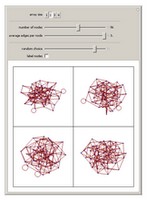
More fun stuff for people who like pictures, but don't necessarily follow all the math: Wolfram has a downloadable viewer and a bunch of fun interactive demos that let you play with sliders and manipulate pictures to generate fun stuff. There are a whole bunch of categories, including "unsolved problems" that might really pique the interest of the math folks. I personally like the graph theory demo section, because of the issues I have with making sense of social network visualizations.

Note to dowloaders: You download the app. Then you start it. It launches a splash screen but seems to do nothing else. Then you click on a demo link on the website and choose "run." That runs it in the application viewer on your machine. To put a demo through its paces, try "Autorun" from the menu under the small + in the upper right corner of the little applet!

Labels: ,

Sunday, April 29, 2007

Workaholics in Consulting and Engineering

Really more about type-A personalities, or at least very driven people: An article in Fast Company on Boston Consulting group trying to get a grip on employees who work too many hours.
"A hero at BCG is not someone whose light is on at 10 at night," says Kermit King, the firm's head of recruiting for the Americas. "The emphasis should be on productivity per hour, and I think there's a point where productivity diminishes."

That's why the firm--which doesn't bill by the hour and explicitly states that hours don't figure in promotions--launched a program called the Red Zone three years ago to spot and tame chronic overworkers.

It's not quite working yet -- perhaps because the workload makes it impossible to succeed within the green zone. They have had a slight decrease in the percentage of employees who say their load is not manageable, though, up to 63% from 67%. (At one place I was salaried, 100% in my department said it was unmanageable. The hours we worked reflected this of course, which is one reason I charge by the hour now.)

A related post appears in the increasingly interesting 37signals blog, on development type A's: Don't Be a Hero. Their gist is that if you haven't finished a task in estimated time allowed, don't push on to do it in more time:

That’s where the concept of sunk cost gives us a guide on what to do. It doesn’t matter what you’ve already spent. That time and money is gone. It only matters whether spending what’s left is worth it or not. Business school 101, but one of the hardest lessons to internalize.
Unfortunately, the switching cost is often high for creatives and execution-driven folks. In morale if not attention to task measures. But in general I think their point is very good.

Labels: , ,

Thursday, April 12, 2007

Logos of Web 2.0

In case you haven't seen this -- at FontFeed, there was a nice deconstruction of the look of web 2.0 company logos. (Thanks to a graphic designer I worked with recently for the link. Same could be done on the websites with probably similar results; I feel like I've seen the 37signals look all over the place in the last couple years.) In a non-graphic designery vocabulary, I myself note a lot of blue and orange, more "soft" rounded fonts rather than angular in this selection, and greys and gradients.

Labels: ,

Thursday, March 29, 2007

Engineering Rewrites and Old Code

Closely related to my Balls o' Mud post about old code bases, the latest Silicon Valley Product Group blog posting is about the necessity of engineering "headroom" for code maintenance during product lifecycles. And about inevitable rewrites to scale, perform, and I'd say, accommodate design of new features, although the article doesn't focus on that issue per se.

I knew ebay had gone through growing pains, but the article suggests some absolute heroics in the form of two mid-growth rewrites of their code that barely touched their business performance. I know of some (plenty) UI designers who've left ebay because of their unwillingness to touch their UI (it sadly needs it), but I do applaud their engineers for their effectiveness at communicating the need to do code work to survive. From the SVPG article:

The deal with engineering goes like this. Product management takes 20% of the capacity right off the top and gives this to engineering to spend as they see fit – they might use it to rewrite, rearchitect or refactor problematic parts of the code base, or to swap out data base systems, improve system performance – whatever they believe is necessary to avoid ever having to come to the team and say “we need to stop and rewrite.” If you’re in really bad shape today, you might need to make this 30% or even more of the resources. I get nervous when I find teams that think they can get away with much less than 20%.

If you are currently in this situation, the truth is that your company may not survive this. But if you are to have a chance of pulling through, you’ll need to first do a realistic schedule and timeline for making the necessary changes that engineering identifies.

If your product is slow, hard to modify, and your code base is really old and hard to understand by your own developers, you should be worrying about your future in the business. Can the people you want to modify your product succeed in actually modifying the product without total internal collapse, at version N? Here's another pointer to that ball of mud article on software architecture growth issues.

Labels: ,

Tuesday, March 06, 2007

Pretty Visual Generators

I've been looking at online generators for the last few days (a recurrent interest) and was reminded of these pretty visual ones. Worth checking out.

Jared Tarbell's beautiful I'Ching interactive display. Hard to describe, and a little mysterious in practice, as it should be.

The Walking Insect Generator, which is also beautiful, but funnier. Seriously, do click and marvel.

A scribbler art project -- this one is fun to watch, like a lot of these visual noise generators. It tends to fuzz up your drawing.

Labels: , ,

Saturday, March 03, 2007

Product Idea Generator

This is addictive, like any good generator. It's especially well-done. Too bad the reload link is so tiny, but you won't miss it. Samples I got:
  • It's a rubber fish that shouts 'WARNING!' at the first sign of danger! It sounds better than it looks and mimics the movements of a lizard.
  • It's a blow-up doll that's inflammable! It kills weeds down to the root and talks.
  • It's a video recorder that scares dogs and stays exactly where you leave it.
  • It's like a normal shoelace, but it runs on six little wheels.
  • It's an aquarium that keeps track of your personal calendar!
  • It's a trouser press that flies like a rocket! It doesn't need batteries and may cause drowsiness.

Labels: ,

Web Log Analysis: Site Flow Charts

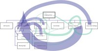
I've been working a bit on web log analysis recently (see my contracting info), and while I didn't deliver this for a client, I did spend a little time seeing if it would be worthwhile to do in the future. After doing the usual freqencies of referrers and requests and such, I also looked at median page views per visitor.

I then did a small sample extraction of page views of the users matching the median page view profile, and generated arcs corresponding to what page types they went from and to. I overlaid them on a site map I threw together, done by hand in Illustrator (and here anonymized): the width in pixels of the line directly corresponds to how many arcs there are between each node (or page type). Blue lines are going into the "purchase" process, while green are just the rest of the traffic patterns. It's a little more suggestive than the simple frequency counts that don't show actual paths; because in this I can see how few people in my sample subset go from, for instance, the "not found" search results to searching again. And it's quite obvious how relatively many people in these logs were buying products while browsing rather than after searching. It's probably worth doing this a larger scale and figuring out a good algorithm to automate the drawing, but I ran out of time on this contract project. If anyone else wants to pay me to do this for their site, drop me a note. :-)

Labels: , ,

Friday, March 02, 2007

Big Ball o' Mud: Code Tangles and Organizations

A friend pointed me to this a month ago, and I'm only getting around to this now: Foote and Yoder's Big Ball of Mud, on legacy code that no one can understand or modify without risk to, well, sanity and schedule.

They illustrate their points with physical world architectural examples, a lot coming from Stewart Brand's How Buildings Learn, because design in other domains and design of software aren't so different when you look closely.  I was, of course, thinking about interface design and organizational design while I was reading it, and about the book Architecture Without Architects, which I really like in both concept and fact after meeting a few (I'm kidding--mostly).  Foote and Yoder's interest in XP (extreme programming) is in part because of the need to accommodate changes in user requirements, but they don't talk a lot about UI design and the difficulties with keeping UI code flexible and modifiable.  (I still think it's a shame that agile and XP communities don't connect and work better with UI/UX/UE folks -- apart from the active agile-usability mailing list, of course.  The goal of a good designer is to get the right decisions made right and executed well; these goals are the same for both UI designers and code designers, and should be the goals of managers and executives who support them.  But.)

Selections from the Ball of Mud article:

  • One reason that software architectures are so often mediocre is that architecture frequently takes a back seat to more mundane concerns such as cost, time-to-market, and programmer skill. ... Architecture is a long-term concern. The concerns above have to be addressed if a product is not to be stillborn in the marketplace, while the benefits of good architecture are realized later in the lifecycle, as frameworks mature, and reusable black-box components emerge [Foote & Opdyke 1995].
  • In other words, the software is ugly because the problem is ugly, or at least not well understood. Frequently, the organization of the system reflects the sprawl and history of the organization that built it (as per CONWAY’S LAW [Coplien 1995]) and the compromises that were made along the way. Renegotiating these relationships is often difficult once the basic boundaries among system elements are drawn. These relationships can take on the immutable character of "site" boundaries that Brand [Brand 1994] observed in real cities. Big problems can arises when the needs of the applications force unrestrained communication across these boundaries. The system becomes a tangled mess, and what little structure is there can erode further.
  • Architecture and code quality may strike management as frills that have only an indirect impact on their bottom lines.

The same can be said of usability and design excellence, of course.  It's a special organization that doesn't erode the desire of people to produce quality work by saying "it's good enough to make us money right now."

A good closing quote: Alan Kay, during an invited talk at OOPSLA '86 observed that "good ideas don't always scale." That observation prompted Henry Lieberman to inquire "so what do we do, just scale the bad ones?"

Pretty often, both on the idea itself and the execution. In the short term, the prototype code works well enough, and the design is okay unless you look closer or start trying to add onto it. Same happens with UI design, without enough iteration, and tacking on new features without refactoring is like adding dirt and grass to a ball of UI mud.

I'm now using the new Office 2007 products, and I regret not seeing more refactoring of the UI, despite the famous ribbon. If you're going to start doing a UI refactor, you may as well go all the way once you've disoriented your users a little bit; for instance, why keep Word's header and footer commands under the "view" tab now, and I have to question whether "home" means anything real to anyone except on a website. Some of the changes are a great improvement, but I think a little card sorting might have helped them out a bit, too, and I find some of these choices surprising.

Labels: ,

Sunday, February 25, 2007

Social Networks of Video Editors on LiveJournal

A few months ago, I did a talk at IBM Research in Cambridge on video (or "vid") editors and their online and offline communities. I made a few social network images, which I thought would be interesting to folks here, and I know I have readers on LiveJournal.

The basic gist of the talk was that hobbiest television fan music video editors existed long before YouTube and their history and organization reflect how they use the internet now -- which is verifiable with some simple data analysis. (NB: I used to be one myself, and in the talk I used a lot of personal examples and anonymized the rest, to protect privacy of anyone who wasn't contacted about this talk. So I'll say "we" here although I'm not practicing myself these days.)

In a quick sum of my talk: We used to do music video editing with VCRs. We existed before the internet was our main way of communicating, and we used fanzines and APAs to exchange tips and tricks (but truthfully, this was borderline before my time, although the friends who taught me all did this). We had and still have conventions at which we showed off our work, to supplement the now popular online posting mechanisms of distribution. (YouTube is not a major site for fan video editors, but another current social network tool that supports video has just become very popular among my friends who use LiveJournal for their conversations.)

Knowing the history makes for interesting cruising of the video communities on LiveJournal. The anime video makers turn out to be, for the most part, a distinct group. This isn't too surprising when you read the "about" text on one of the video community pages (slightly disguised here):

Anime "vidders" are told they may not be as comfortable here, and that VCR vidders are welcome.

This image shows the network of members in the anime community (highlighted) which is somewhat separate from the group (and its affiliates) quoted above:

One of the communities that is closely related to this one is one in which an annual face-to-face convention is discussed, started and fed by some of the older VCR editors and now pretty much populated by the non-linear digital folks, of which former VCR people are now a part. The convention-discussion community members, highlighted below in orange, are closely interconnected to the community quoted from above, which is circled in red here:

The group circled in blue is a Battlestar Galactica video group, less closely related but more so than the anime group. The closely inter-connected groups in these images are the generic discussion groups, at which the craft and technique and technical discussions occur. More specific discussion groups are generally less connected.

I made these images with prefuse, and apologies for the quality of the uploads. I'm available to talk about this stuff anytime :-)

Labels: , , ,

Saturday, January 27, 2007

MultiTouch Display

I guess it's a Tipping Point phenomenon, but I wonder who the cool kids are, everytime this happens. The iPhone demo features a multitouch display, and Jeff Han's demo of this functionality on YouTube has been getting a lot of blognoise; but this idea has been around in the research community for a while. What makes something finally get out of R&D "interesting idea" and into "must have innovation wow" in a product seen as widely as the iPhone? It was even around at Apple, and ignored for years. What does it take to get visibility and get on a product development and business radar? Some links:
  • The Jeff Han video that's been circulated a lot (ok, points for music, for high density of info and fast cutting to demo points -- is this what makes it spreadable?)
  • The Tog column that discusses some of the design history that went into the iPhone (many many ideas over many years, including random access voicemail -- we discussed and prototyped this at AT&T and at Excite 10 years ago too), some of it (but not most of it) at Apple itself.
  • Bill Buxton's article referenced by Tog on multitouch displays. I know some of the people he's referencing, and I feel their mystification too.
I guess this is one of the reasons I stay as plugged in as I can to what's happening in R&D--the best of that work will eventually make it into products, and I'd like to lessen that time by figuring out the tipping point for it.

Labels: , ,