Tabs Gone to Hell
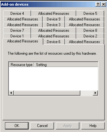
Everyone knows by now that multiple rows of tabs aren’t such a good idea – or do they? Here’s an egregious example from my new Thinkpad. This has more than a few tab-related problems: there’s some kind of duplication between resources and allocation (2 tabs for each overlapping concept); many of them seem to be empty anyway; there are so many that’s it’s actually hard to go through them all, even with the counting option, because there’s so much shifting around as you click on them (making it hard to tell what you’ve seen already).
This UI is a small part of a worse UI issue: the Thinkpadders duplicated a bunch of OS-level stuff, often by overriding it completely, in their own custom UI. This is particularly awful in the area of networking. There's no way to scan for Wireless networks from the Microsoft dialog-- you have to figure out it's been overriden and is controlled from somewhere "new" and how to work that instead.
Why do companies so often make the mistake of trying to "brand" the hardware experience with their own custom (often poor) software experience where it's not needed? (Ok, it's still a sore spot from my TiVo era.)