Sunday, March 22, 2009

R, for Open Source Data Goodness

After I left The MathWorks, I stopped being able to afford MATLAB for stats, and switched to the open source R. Recently, there have been a few articles on how R is being used at companies like Google and Facebook (here and here). I thought I'd post some names of books and sites to help out those new to R.

Some books:

  • Data Manipulation with R, by Phil Spector. One of the new Springer R series, and note that these books aren't cheap. This could be twice as long as it is, and I found a lot of the meat is towards the end. But still a good book to have. The power of R is that it's a programmable environment, allowing you to do data transformations on the fly, as well as automating your tests/displays/operations. You have to know how to move stuff around.
  • Lattice: Multivariate Data Visualization with R, by Deepan Sarkar. Lattice is a very powerful visualization library, highly recommended. This is The Book, another Springer one.
  • Interactive and Dynamic Graphics for Data Analysis With R and GGobi, by Dianne Cook and Deborah Swayne. You can check out the GGobi site for flavor. I will have to admit that while my initial forays into using it have been enticing, the UI has some learning curve, and I've backed off a bit and not gone in very far yet. YMMV.
  • Statistics: An Introduction Using R, by Michael Crawley. This is an excellent book; it has intro stuff and is very deep on the stats, in terms of application and big picture. Obviously all examples use R, so you can replicate anything you want. The almost artistic side of statistical modeling really comes through here. Don't be fooled by "introduction," though - it's not light and easy reading.
  • Introductory Statistics with R, by Peter Dalgaard. I think this is more basic than the one by Crawley. Or just not as deep. I don't look at it as much-- mainly for contrast.
  • A Handbook of Statistical Analyses Using R, by Brian Everitt and Torsten Hothorn. A heavy-duty guide with applications of different methods for different types of questions and data sets, including (e.g.) survival analysis, recursive partitioning, multidimensional scaling, longitudinal analysis. A good purchase.
  • R Graphics, by Paul Murrell. This is not my favorite book. You can customize anything in an R graph, but it's nasty and difficult to do so. The book doesn't make it easy, and neither did the course I took online from statistics.com from the author. Still, this could be kept around for extreme need. Some of the chapters and source code live here on his site. I think you're better off getting Lattice, which is slightly higher level; and if you must get very pretty output, get the numbers or basic shapes out and use another tool like Excel or Illustrator. Except this guy Steven Murdoch had some real success in his Tufte experiment with R, shown below:
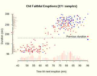
Steven Murdoch's Graph in R

Some tools and helpful sites:

  • Quick-R, a great site for getting started, and getting readable nice overviews of different techniques. Lots of pointers and basic help for stuff like graph customization.
  • Togaware's Rattle GUI - a timesaver for a bunch of basic and advanced descriptive stats.
  • I use SciViews as my R UI, because it has a variable browser and a script area. Some people like Tinn-R. I haven't checked out the emacs client for R yet but intend to.
  • There is an R Python interface. Haven't used it, but it makes me happy. (Other languages are supported too.)
  • Since R is open source, most of the useful help lies in mailing list threads. There are a few R-specific search engines, including Dan Goldstein's and others listed here on Jonathan Baron's page.
  • A nice list of R "tips" lives here.
Well, this could go on for quite a bit... R is infinitely powerful, but has a learning curve. That flexibility really pays off, I find! Excel just doesn't scale for big data problems.

Labels:

Sunday, August 03, 2008

Wordle on Ghostweather

Playing with Jonathan Feinberg's artistic tag cloud generator Wordle, I plugged myself in (of course) and got this one (this is the "ghostly" color scheme):

Randomness is a powerful toy in design - it helps you discover things you wouldn't have seen with a purely organized eye. It's inspirational. It's fun.

Labels: ,

Monday, March 10, 2008

Singles Ad Humor

Trying to ignore a sucky day, here are three coincidentally discovered items on dating that had me snickering this weekend. The first is the oldie but goodie by the very funny Joel Friesen, "WHY YOU SHOULD CONTINUE TO DATE ME; A SERIES OF CHARTS AND GRAPHS." For wacky uses of charts, it does not get much better. (Apparently she just concluded he was weird.)

Also from Joel, his second item of snigger-worthiness is his study of an online singles site's weirdest ads and criteria. This is in Fun with Lavalife. One of the finds:

Old White Ladies who Love Rap. If you refine a search down to its most basic elements you can find some pretty unique people. I looked for anyone over the age of 70 who lists rap music as their main source of inspiration. Oddly enough there is a bunch. But most seem to have accidentally filled in their age wrong, or they have incredible skin for a 103 year old gangsta.
Shortly after this, I looked over an art project on dating, called I Want You to Want Me, by Jonathan Harris and Sep Kamvar. I can't make out most of the screenshots, but the "Highlights" quotes rock. Here are a few:
  • I'm interested in meeting a lusty male who dreams deconstruction and dismantles stale ideologies
  • I'm looking for a virgin supermodel nymphomaniac with huge breasts that owns a liquor store.
  • I'm looking for someone who can make my heart beat fast (not to be confused with giving me a heart attack).
  • Looking for an entry level or junior administrative assistant who is willing to have some naughty fun with her older boss once a week, or maybe more if she’s willing.
That last one might be an actual job ad, not a singles ad. Who can tell? Now that I see these, I feel I missed a real data mining opportunity when I used one of these sites in California. It could have been so much more fun!

Labels: ,

Saturday, February 23, 2008

Brain Cloud

Kyle Gabler's home page charms me as much as his simple but fun and well-executed word association game: Human Brain Cloud. You play by typing in words you associate with other words, and he grows the network of associations on the fly. The graphs are pretty to watch, easy to explore, with great motion effects; and his page of stats on players is suprisingly extensive.

Also, I adore his cartoon art. :-)

Other viral, simple online games: the Free Rice game, Just Curious (answer a question before you can ask one), the ESP game (labelling images).

Labels: ,

Monday, February 18, 2008

Colbert Bump for Books

I love this type of real world data analysis: Juice Analytics has done some data mining on book sales following author appearances on the Colbert Report, and finds that the more liberal folks get a bigger sales bump! Not what might be expected, unless you expect that fans of the Daily Show watch Colbert-- which I would expect, despite Colbert's apparent right leaning.

Here is one of their graphs, normalized and aligned for when the authors so classified (by them) appeared and their change in sales figures inferred from Amazon rankings. They also cite an interesting academic study of whether used book sales cannibalize new book sales on Amazon, which finds they rarely do.

Labels: ,

Wednesday, September 12, 2007

Infovis at Yahoo

Apparently infovis is the new design black -- except design always had black, so that's not quite right. In any case, the new Yahoo Design Innovation Team site features more infovis displays than actual design work. By this I mean it features projects that display nice visuals of data, usually over time, in the form of movies. There is a lot of rhetoric in the intros about "unexpected patterns," but I must admit to finding a lot of them a little opaque. Only one of the projects is interactive, a cute but not very compelling "design a plant" flash application.
There seems to be an explosion of information visualization artwork suddenly, I suppose because the tools to create it are ripe and available. (Data is available as well, especially if you work inside a Yahoo or Google, but that's not even necessary.) But, curmudgeonly, I'm irritable at it, because so few of them feel polished into usefulness or offer useful interactivity. Infovis needs usability (and evaluation), too, like other design artifacts.

Other observations on infovis displays of recent months: time series data is the current black of infovis -- showing changes over time, usually in animation format. Perhaps it was last season's black, because it's everywhere in the current crop of visualizations, including those on Yahoo's design site (traffic issues in LA, trips -- similar to the beautiful one in processing of airline flight patterns). This makes tremendous sense -- as humans we live in 4 dimensions and it's nice to get information about that 4th one. However, just because it's visible, doesn't make the story it's telling useful. Sometimes you want to take an insight from the time progression you watched and flatten it back into 2 or 3 dimensions to get the story summarized in a form that's useful without it disappearing in time. I don't see this option to convert easily from "playback" to flat summary of a time window in most time series animations, and would often like it. (Bar charts that move over time aren't what I'm talking about, because those are still moving!) Notice that this request asks for not just visualization, but actual interactive tools to play with the data and explore it!
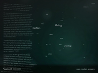
The other thing many folks are exploring, and I think less successfully, is text data. Unstructured text offers a few obvious and old hooks: context around specific words and word or phrase frequencies. Beyond that, things get hard fast, because you have to think about parsers or other complex data mining models. Text vis is the ultra-violet of infovis. There are a couple projects on Yahoo's page that inspect word use at the basic level: the pronoun context display, and the answer cloud frequency display (why are piercings and hysterectomies showing up so often? Is this an artifact of the time window she looked at or something about the user populations issues?).

Regardless of the curmudgeony post, it's nice to know where Joy Mountford is these days.

Labels: ,

Saturday, August 11, 2007

Victoria's Secret Market Research? Or not.

From my huge backlog of things to post, today I choose Victoria's Secret's online survey -- because I'll be tickled by the effect on my web logs.

Yes, in the past I have bought from VS, and do still buy their bras from time to time, despite the price tag. So I got sent an online survey. I always take these market research surveys for professional reasons, since I write them myself for clients from time to time. This one was, well, just strange.

It's hard to judge it as bad or good without knowing what branching logic they have built in. Branching means: If a respondent picks option (a), show them a different followup set of questions than if they had picked option (b). So I may not have seen the whole thing, and may have ended up in a strange cul-de-sac for people who buy bras because they're sexy. I hope not.

When I got to this checklist of "how does your bra makes you feel" (or somesuch), I was genuinely surprised. There are no negatives in here, and the word "supported" doesn't appear. I wonder what they can learn from this, apart from what they want to hear? The only way to avoid their positive bias is to check nothing, which I suspect will be tough for that helpfully-minded customer set that like to fill out surveys.

Previous to this question, they asked about other retailers you buy from. Now, if they had the usual sort of market research plan, I would expect to see an attempt at a basic SWOT analysis on the results: analysis of their strengths, weaknesses, opportunities, and threats.

How do you do that? Well, the logic is roughly this:

  1. Ask:Where do you buy your bras?
  2. Ask:What's important to you about your bra?
  3. Ask:What's your feeling about the bra you bought?
  4. Data analysis: For people who bought from us in (1), what's the difference between (2) and (3). If there's a big gap, that's our opportunity, going forward. (And roughly, strengths and weaknesses, when you compare against people who bought from Sears and Macy's and Frederick's of Hollywood on the same dimensions.)
If they're going after pure brand image and evaluation of their own success at achieving it, I think they still screwed up. Or at least they lost a serious opportunity in their data collection. They know where I shop (or where I said I shop, where I remembered I shopped), and they didn't have any adjectives that don't seem to be their personal target brand image in the list.

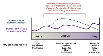
With the right vocabulary choices, including negatives and neutrals, they could have done some interesting segmentation based on where their own customers fall in "feeling" versus the other retailers' customers. Something like this:

They can always conclude from their data that some of their customers aren't that interesting to them from a marketing perspective (e.g., the people who shop at Sears, like their stuff a lot, and only occasionally go into a VS store -- because they'll be hard to capture if they're not dissatisfied enough with Sears).

In any case, some other common mistakes I see in market research via survey:

  • You try to collect too much in one survey, and can't do the analysis (plus you irritate the people who filled it out). You can always get more data later in other forms.
  • You don't know what you're trying to get out of it, so you can't construct the instrument well to get anything at all.
  • You set it up to learn what you want to hear (which is what I think was going on with VS -- I won't even tell you about the underwear questions), so you learn nothing and waste time, money, and your customers' patience.
  • You collect the data, then don't know what to do with it. You either don't do much, because of lack of skills in data analysis (clustering, mining, etc), or worse, you do nothing. You have it, but didn't take advantage of it. (This makes me quite uptight when I run into it. Good data is gold. My consulting tagline is "data-driven" for a reason.)
  • You solicit data from the wrong people, but don't even know it, because your survey didn't check on their credentials for answering and providing input. So you can't toss out any of the responses to clean the rest of the data.
End data rant of the week... I think I'm going to Sears now.

Labels: ,

Wednesday, May 30, 2007

LiveJournal in the Blogosphere

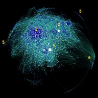
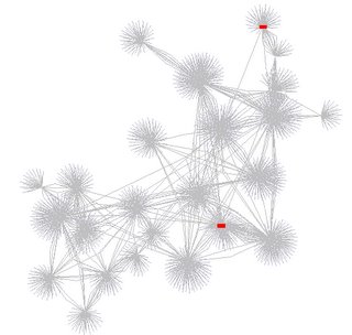
Work by Matthew Hurst on mapping the blogosphere has been blogged around recently, particularly because of his cool hyperbolic graphs of the huge data set of linkages, one shown above. I post here because I've got friends reading on LiveJournal -- I know LJ folks occasionally wonder why the press about social networking sites rarely mentions LJ, favoring MySpace and others. One reason may be that LiveJournal is a fairly close-knit and separate community site, with a lot of internal links via friends lists, and not a lot of other blogging post cross-over or linkage in. (I don't know how he handled syndication on LJ friends lists, if at all.)

LiveJournal's small network cluster is shown in the image as cluster #3. The others are (1) DailyKOS, (2) BoingBoing, (4) other political bloggers, (5) porn, and (6) sports fans. LiveJournal is further out than the porn fans, but bigger! Smaller than sports fans, though.

Labels: , ,

Saturday, May 26, 2007

Funny Networks

I really appreciate a sense of humor in a network diagram. Here are two unusual ones found on visualcomplexity's feed, introduced with such sober and boring description that I was saddened for the VC readers who are probably missing the fun here.

The Story Map is a social network diagram of a wedding party, with the arcs annotated by relationship facts that link the nodes. It's beautiful and inspirational. Why are social network pics not funnier in general; relationships are, right? (Well, some. I guess professional ones aren't very. At least the publishable diagram versions.)

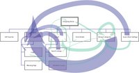
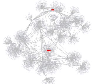
Next is a bigger investment, but worth it if you love detail (of the really obsessive type). An art project by Media A of massive size (10 meters), it's a representation of a fictitious designer's life spanning a century into the future. The Networked Designer's Critical Path is a PDF (3 MB) that takes time to download, but I guarantee it's very amusing and science fictional. Here's an excerpt (English in light gray):

Notice the chronic over-networking issue in the center there. Heh. My printer dialog says it would be 171 pages if I tiled to print this sucker at 100%. I'm tempted anyway.

Labels: , ,

Sunday, May 20, 2007

Digg Labs Infovis

I've been enjoying the latest infovis apps from Digg Labs, co-created by Stamen Design (I want to be them when I grow up) and funded by Intel.

These cool applications let you watch digg news stories being posted and re-dugg in real-time. They're all good at different things, and compelling for different reasons.

My favorite in terms of "hypnotic to watch" is the swarm. It's eye-candy for the ADD set.

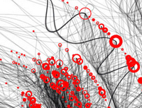
It does have some issues as a tool, however -- if I were them, I'd have prioritized the display of the text identifying the article over the other graphics, rather than letting it mix in with the background (see above). Also, I don't entirely understand the beautiful mysterious arcs that sometimes appear, but I'm not sure I care, either.

While watching a bunch of these, the role of time gets problematic for me. I'd like to be able to replay, or step backwards (like if I missed a cool event in the swarm). And watching the big arc display for "newly submitted" in the category of science is really boring, or was on Saturday night. (See if you can even figure out how to do that that!) Finally, I would far rather go right to the article itself than click through the digg page first. That's a minor quibble, though.

There's a definite long-tail problem on digg, isn't there -- lots of the same stuff gets dugg, and it's hard to find high-quality new stuff that matches your interests.

Labels: ,

Sunday, May 13, 2007

Mathematica Graphs and Other Demos

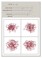
More fun stuff for people who like pictures, but don't necessarily follow all the math: Wolfram has a downloadable viewer and a bunch of fun interactive demos that let you play with sliders and manipulate pictures to generate fun stuff. There are a whole bunch of categories, including "unsolved problems" that might really pique the interest of the math folks. I personally like the graph theory demo section, because of the issues I have with making sense of social network visualizations.

Note to dowloaders: You download the app. Then you start it. It launches a splash screen but seems to do nothing else. Then you click on a demo link on the website and choose "run." That runs it in the application viewer on your machine. To put a demo through its paces, try "Autorun" from the menu under the small + in the upper right corner of the little applet!

Labels: ,

Sunday, April 22, 2007

Fractal Art

I've been playing with 2 fractal-generating applications recently, and recommend them for different reasons. If you'd like to quickly generate random beautiful 2d images, of often breath-taking beauty, use Apophysis.

If you like to play with dials and sliders and 3d imagery, and generally do a bit more work yourself, I recommend Chaoscope, a "3d strange attractors" rendering package.

Samples from both:

Labels: , ,

Saturday, March 31, 2007

Visualizing Poetry

April may be the cruelest month, but it's also the month of poetry, and Knopf does an annual poem-a-day mailing list, which I highly recommend. Thanks to my friend Tina in Seattle, I've been on this list for the last 3 years and loved every day of April.

Nine years ago we began a Knopf tradition. To celebrate National Poetry Month, we sent a poem a day by e-mail for 30 days to anyone who asked to receive them. Now, with over 25,000 subscribers, we are proud to continue with a whole new series of daily poems. Each day during the month of April you will receive a poem from some of the best poets in the world including Mark Strand, Sharon Olds, and Laurie Sheck, as well as classics from Langston Hughes, Robert Burns and more. If you know of someone who might like to join the poem-a-day party, they may visit http://www.randomhouse.com/knopf/poetry/poemaday/ to sign up.

In honor of poetry visual and written, here are some samples of Boris Muller's visualizations of poems for the annual Poetry on the Road conference in Germany.

And see the great summary of other notable vis work in Ping Mag's article on beautiful data visualizations, based around an interview with the editor of the popular Infosthetics blog. (Thanks for the pointer, MJ.)

Labels:

Saturday, March 24, 2007

Web Infovis: Crispyshop.com review

Found on Information Aesthetics, a regular read for me...

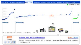
Crispyshop.com is a fascinating blend of data and shopping results that, sadly, doesn't quite work for me on grounds of overall design usability. I love to play with it, but I can't figure out how to use it to pick the GPS device I'm looking for. It has some very basic issues, which in this era of "user experience" shouldn't be happening! (Hey, I know, hire me to consult for you, guys!)

The main display is this very fluid graph showing price on the Y axis, and the dots represent products. The green dots are a great idea, but don't work in practice: you see one suggesting it's a better "deal" (by some number of unknown factors) and you head for it, and it disappears. The UI is simply too fluid. Also, you should never get an error for a simple search like the one I just got:

Whatever you do, you've gotta return results from any search done. Not an error and not a "not found" page. Finally, once I did find a product I wanted to look at, I did the usual thing -- clicked off to a merchant site to look at the details there to make sure it's what I was expecting. And an annoying popup error kept grabbing me back to the crispy page: "A script on this page is causing Mozilla to run slowly. Abort it?"

One last bash: the passion here is in the beautifully fluid graph details, clearly. To the left of it is a disappointingly "normal" set of filters that most people just don't use when searching, because they pose various cognitive problems when you're just browsing around and trying to educate yourself about a product space. These ones are particularly poor, in that the pulldown menus don't show the number of results associated with each choice (for instance, if I filter by "10% off and More" will any show up, or will I be wasting a click?). The way Kayak.com handles this is inspirational, of course, in that you get lots of information to help you manage your filters, including some little graphs showing ranges. Wine.molecular.com's demo app is a nice one too, but only works in IE for me. They show a small barchart, but only when you mouseover the slider:

Search is hard to design well: it's all about successful data reduction, for the end-user. People don't scroll through pages of results. But I'm always disappointed by cool ideas partly executed. Is the Crispyshop site intended to support a common task, or just showcase the author's brilliance in one domain (and I admit, he's pretty brilliant at that)? Is it meant to be done, or is it another beta like the endless Google beta empire?

This sadly reminds me of the conversation I had with a spokesperson for Tableausoftware at last year's Infovis conference: There was no usability testing done for that product during design, and it shows in use. I needed an in-person tutorial to get anywhere with it after having downloaded the demo version already. The functionality is excellent, but for a new user making a purchase decision, that's unfortunate in today's software world. Old software products, I will cut them some slack -- but a new product? Even just a professional once-over by someone like me can help catch a lot with the basics.

Labels: ,

Saturday, March 03, 2007

Web Log Analysis: Site Flow Charts

I've been working a bit on web log analysis recently (see my contracting info), and while I didn't deliver this for a client, I did spend a little time seeing if it would be worthwhile to do in the future. After doing the usual freqencies of referrers and requests and such, I also looked at median page views per visitor.

I then did a small sample extraction of page views of the users matching the median page view profile, and generated arcs corresponding to what page types they went from and to. I overlaid them on a site map I threw together, done by hand in Illustrator (and here anonymized): the width in pixels of the line directly corresponds to how many arcs there are between each node (or page type). Blue lines are going into the "purchase" process, while green are just the rest of the traffic patterns. It's a little more suggestive than the simple frequency counts that don't show actual paths; because in this I can see how few people in my sample subset go from, for instance, the "not found" search results to searching again. And it's quite obvious how relatively many people in these logs were buying products while browsing rather than after searching. It's probably worth doing this a larger scale and figuring out a good algorithm to automate the drawing, but I ran out of time on this contract project. If anyone else wants to pay me to do this for their site, drop me a note. :-)

Labels: , ,

Sunday, February 25, 2007

Social Networks of Video Editors on LiveJournal

A few months ago, I did a talk at IBM Research in Cambridge on video (or "vid") editors and their online and offline communities. I made a few social network images, which I thought would be interesting to folks here, and I know I have readers on LiveJournal.

The basic gist of the talk was that hobbiest television fan music video editors existed long before YouTube and their history and organization reflect how they use the internet now -- which is verifiable with some simple data analysis. (NB: I used to be one myself, and in the talk I used a lot of personal examples and anonymized the rest, to protect privacy of anyone who wasn't contacted about this talk. So I'll say "we" here although I'm not practicing myself these days.)

In a quick sum of my talk: We used to do music video editing with VCRs. We existed before the internet was our main way of communicating, and we used fanzines and APAs to exchange tips and tricks (but truthfully, this was borderline before my time, although the friends who taught me all did this). We had and still have conventions at which we showed off our work, to supplement the now popular online posting mechanisms of distribution. (YouTube is not a major site for fan video editors, but another current social network tool that supports video has just become very popular among my friends who use LiveJournal for their conversations.)

Knowing the history makes for interesting cruising of the video communities on LiveJournal. The anime video makers turn out to be, for the most part, a distinct group. This isn't too surprising when you read the "about" text on one of the video community pages (slightly disguised here):

Anime "vidders" are told they may not be as comfortable here, and that VCR vidders are welcome.

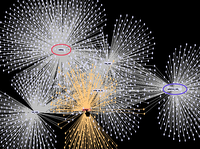
This image shows the network of members in the anime community (highlighted) which is somewhat separate from the group (and its affiliates) quoted above:

One of the communities that is closely related to this one is one in which an annual face-to-face convention is discussed, started and fed by some of the older VCR editors and now pretty much populated by the non-linear digital folks, of which former VCR people are now a part. The convention-discussion community members, highlighted below in orange, are closely interconnected to the community quoted from above, which is circled in red here:

The group circled in blue is a Battlestar Galactica video group, less closely related but more so than the anime group. The closely inter-connected groups in these images are the generic discussion groups, at which the craft and technique and technical discussions occur. More specific discussion groups are generally less connected.

I made these images with prefuse, and apologies for the quality of the uploads. I'm available to talk about this stuff anytime :-)

Labels: , , ,

Wednesday, January 24, 2007

Democratizing Data Insight

It's an exciting world right now... i-Stuff and the spread of "design" as a buzzword aside, I'm thrilled by the spread of data and graphs into the public world. A few recent pointers on the theme of public data exploration:
  • Gapminder.org's Hans Rosling presented to TED a year ago, with the beautiful animated charts that his site made famous. His final comments say, in paraphrase, "Publically funded data is public, but hard to get at, hard to search, and presented in boring ways. We can and should change this." One of his great takeaways, for me, from his data illustrations of "third world" healthcare is that the error in the data is no doubt much less than the truth in it, at the magnitudes he illustrates.
  • Swivel is a new site for data upload and exploration, with a fun blog. They also allow community discussion around their charts. I like their enthusiasm and enjoy the blog a lot.
  • Friends from IBM (Martin Wattenberg and his group) have just announced a similar concept to Swivel's, but with even more graph types and they're all nicely interactive. Upload data, create a picture, and post it... other people can play with your data and present their own insight pictures, or modify yours. And comment on them. It's Many Eyes, and it even has a nice website!
  • Google claims to be making real time stock quotes available, which means live data plotting is possible. Found on swivel's blog, a post on Googleblog: Real Time Quotes for Free.
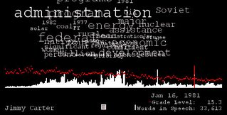
  • And don't forget processing.org. There's a nice visualization of State of the Union speeches highlighted there, including word frequencies and grade levels of the speech. (It's by Brad Borevitz.) They've been averaging around 9th or 10th grade level, but notice the great spike of Jimmy Carter's at grade 15.

Labels: ,

Thursday, January 18, 2007

Powerpoint Hilarity

Le Grand Content by Clemens Kogler is an animated riff on powerpoint presentations of data and Big Questions (mostly those found in bad teenage poetry). It's very funny. Go and click on "view movie" and giggle.

Labels: ,

Sunday, November 19, 2006

Data and Infovis and "Art"

I've been thinking about data a lot, since the Infovis 2006 symposium. At this conference was a strange mix of scientists, mathematicians, and a few artists, or those with an artistic bent.

My friends Martin Wattenberg and Fernanda Viegas from IBM Reseach Cambridge secured funding, invited submissions, reviewed, set up the equipment for, and then sat guard over (missing talks in which they were cited) an art show of infovis applications. They were specifically featuring artistic displays of real data (I'm paraphrasing what I think they said were their selection criteria. One was Golan Levin's The Dumpster, which I blogged about a while ago.)

To introduce this art show, they gave an excellent talk that I'd summarize as "What's Going On Out There in the Real World That You Might Not Know About." A bunch of us saw a lot of people in the audience noting down the existence of Ben Fry's Processing Toolkit that makes programming datavis apps accessible to artists and ordinary people who aren't postdocs in mathematics. Sadly, it reminded me of 5 or even 10 years ago when the CHI and CSCW research communities realized web startups had already made community apps that worked and they weren't made by researchers in labs. Where's the actual innovation happening? More often than not, it's students or other clever people with time on their hands and a willingness to play around.

But back to data: When I was doing my dissertation, data was a sticky subject. Collecting data on "human subjects" was overseen by strict board reviews and ethical examination, and I had to go through this as an early internet researcher with a Human Subjects Board who didn't know what to do with this kind of data.

The community I "studied" reacted strongly to some of the data that I collected, post-processed, analysed, and reported, regardless of the reviews I went through. My data said some things that they didn't want made visible, or suggested things they didn't like simply reducible to graphs and charts. (The book is available here, the last chapter discusses this problem in some detail.) Anyone who looks at or exposes recorded human behavior is going to hit this: for example, people who don't think they talk much and discover they talk all the time often don't like knowing this, however measurable it is and however potential this exposure might be for them. Which brings up the questi0n of why and when should you turn something into data? And analyse it?

So, thinking now about how the research and infovis worlds have evolved since then, and the new inevitability of data mining on behavior from the traces we leave behind us, I see these data source dimensions:

  1. Data sets that exist and are known to exist-- census data, weather data, stock market data.
  2. Data that "happens" but isn't necessarily assumed captured or turned into a set that's easily analysable: email, chat, mobile phone records, my retrievals from ATMs, where I walk and what I eat.
  3. Data that we set out to measure, because we're looking for something: experimental data, NSA tapping us, etc.
  4. Data we have (from any of the above means) and we converted to another form of data: e.g., turning activity logs into summaries of time on tasks, turning gene sequences into musical notes, turning video of your cats into a single overlayed image, turning text into images, etc.

The really creative apps for infovis often seem to lie in item 4), because transformation of data into other modalities is a trick of visualisation that might give us insights we didn't have before. Some of them are just elegant visualisations of data we wouldn't have thought of visualising (like Ben Fry's zipcode applet that Martin called an infovis "haiku"). The "insight" part is still tricky to handle; human perception differs, and reasoning skills differ, and that makes drawing conclusions from visualisations tricky too. (Untutored people generally make more of statistical tests than they should, too.)

Martin and Fernanda stayed safely away from defining "art" but I still thought about the artistic component of data mining. The value of data mining and the ability to form and then test hypotheses from different views of data is a skill, perhaps even an art in itself. An event occurs: I capture it, I capture multiple instances of it, and I look for patterns in different views of it, and then I learn from it or measure it some more or in another way to progress towards some truth.

Or, for the more artistic data visualiser: she captures it and events like it, she presents it in a novel and beautiful way, hopefully with some elegant interactivity, and other people learn something. The might learn something ineffable or impossible to reduce to words. But that doesn't make it less important. Scientific creativity still springs from the indescribable ideas you have about the world before proof and publishing.

Labels: ,

Sunday, August 13, 2006

Excel Tricks

Gotten off Information Aesthetics, and making my weekend a thing of beauty (well, also the good weather helps): Lightweight data exploration in Excel, from Juice Analytics.

This is so simple it's genius. I feel like a dork for never thinking of it. These are some lightweight way to create visuals like sparklines inside your Excel spreadsheet using really simple formulae. (This will be built-in in Office 12, but meanwhile, why wait?)

The bar graphs are built using the Excel REPT function which lets you repeat text a certain number of times. REPT looks like this:

=REPT(text,number_of_times)

For instance, REPT(”X”,10) gives you “XXXXXXXXXX”. REPT can also repeat a phrase; REPT(”Oh my goodness! “,3) gives “Oh my goodness! Oh my goodness! Oh my goodness! ”

For in-cell bar charts, the trick is to repeat a single bar “|”. When formatted in 8 point Arial font, single bars look like bar graphs. Here’s the formula behind the bars:

As the guy notes, when you're doing data exploration, you don't want to struggle to figure out which values created which outliers. Big plots are nice for an overview, but you still have to do work to figure out which items generated which points. ("Data brushing" is the common technique in infovis circles for getting this kind of info, but it's work to implement.) Why not get at what you want right in the spreadsheet itself, so you're looking at the data and the visual right at the same time? He has a good example showing the value of this in action.

The followup responses to his original post got even better. Check out these tricks to do this kind of stuff:

Updated to add: Here's even more fun off Juice! Tufte-style charts in Excel, with a downloadable file to play with.

Labels: ,

Sunday, June 11, 2006

Jobs on BayCHI

This weekend, Don Ahrens announced that he wouldn't be posting the BayCHI job list anymore. This important job listing is on hiatus till another owner can be found and trained.

It's easy to say Don did the user experience profession a great service with this list, but it's very hard to imagine where some of us would be without it. The BayCHI chapter of the Special Interest Group of Human Computer Interaction (SigCHI) is a major force for professional good, offering great talks by industry stars and important networking opportunities. (I just looked at their page and discovered that a friend from the UK whom I haven't seen in 10 years is speaking this month, and I'm missing it!) The Bay Area is the spiritual home for user experience professionals, rivaled only by some odd corners of Scandinavia. That job list, to which many non-locals subscribe, is one of the best ways to track industry opportunities in interaction design and usability. Watching that list gives one important insights into what's going on at major software companies. Jobs outside the Bay Area are regularly posted there, because of its large readership and the recruiting pool that exists in the Bay Area. I myself have been reading it since grad school.

In honor of Don's tenure (how long HAS it been? I can't remember when he didn't run it!) I've made a few retrospective graphs of the job list contents from 2003 to 2006.

Unsurprisingly, the growth of the stock market matches the growth in the raw number of job postings appearing on the baychi list. We're averaging around 70 to 90 jobs every weekend right now, incidentally. This picture shows the raw counts of job posts overlaid on the percentage growth of the NASDAQ.

If we look at the actual companies posting jobs, it gets more interesting. By raw counts, you see some of the big tech names you'd expect to see.

Check out the major players in user experience on the left edge.

Now, these are dumb data points -- we know nothing about actual filling of positions, or how many times a job was reposted or how many positions each posting represented. One major caveat there: the Google NY jobs have been open for almost a year, I think, without disappearing, so this is inflating some of their stats. The Trend Micro positions in East Asia were likewise open forever.

Regardless of the potentially misleading nature of these numbers, the stats do get more interesting when you compare the size of the company with the number of UX jobs posted on the baychi list. For the public companies that I could track down, I resorted by the higher ratios, and this shifts the list tremendously. Microsoft, for instance, falls way back down, as does Oracle.

As a former TiVo employee, I am not surprised to see them leading the pack (even when I know that their numbers are probably inflated by difficulty of hiring, and recent departures of key folks -- but then, everyone has this problem, right?). More interestingly, Shutterfly comes in second now. Shutterfly is where my former UX Director from TiVo, Kyrie Robinson, landed post-TiVo departure. Ah, suddenly not so surprising to see Shutterfly second to TiVo. (She has just left Shutterfly to take a VP role elsewhere with the words "User Experience" in the title, a rather rare position name.)

Now, what jobs are being posted? Simple word frequency on the titles shows us an interesting pattern...

Senior interface designers top the most wanted (or bottom, in this graph). Usability and user research positions trail rather in comparison. This is actually a nice trend for the industry, since Don Norman noted a few years ago that "design is where the action is." As a hiring manager seeking senior UI designers, their popularity is bad news for me; it's very, very hard to hire them. There aren't enough, and they're clearly in high demand.

Labels: , , ,

Sunday, May 21, 2006

UFO Maps

Alright, this really tickles me: UFO Maps, brought to you by a mash up of Google maps and the National UFO Reporting Center.

Click on a cute little flying saucer graphic and you can find the report associated.

Edited to add: Here's another good one: Real-time satellite tracking over Google maps. Real-time in that the little satellite graphic moves as you watch, and the map shifts under it.

Labels: ,

Saturday, May 13, 2006

PersonalDNA

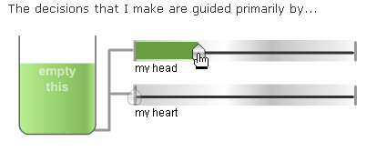
There are personality quizzes all over the net, spread as memes via sites like LiveJournal where memes have a long life. PersonalDNA is a next-generation personality quiz, with high quality widgetry that the respondent has to manipulate to set their answers. While fun to take, I am not so sure that all that gadgetry entirely supports the problem at hand and it probably detracts a bit. I found it hard to figure out where in a quadrant of 4 my "dot" should live in a case like this.

On the other hand, it's very fun to take, and you get the results in nice couple of visuals suitable for posting in a blog with the URL; and you can ask other people to rate your own personality and compare the results. It has all the makings of a successful meme, and for once it looks like some serious visual design and engineering went into the site. I wouldn't be surprised if someone like this finally figures out how to make some money off this stuff; there's millions here waiting to be had, given the massive popularity of these quizzes in social sites.

Incidentally: I came out as a "Benevolent Inventor."

PersonalDNA | Your True Self Revealed - Fast Fun Free Personality Tests.

Labels: ,

Sunday, April 30, 2006

NY Times' market graph toy

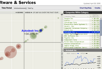
I'm only calling it a toy because it's fun. All infovis should be fun, frankly. This is another one off Information Aesthetics: the Sector Snapshot. You can pan around, change the dial for time window (weekly on up to quarterly or yearly), and hover over both the bubbles and the text (and sort the text). You can get a detail view of an individual performer in the lower right by clicking on a player. The animation is really nice and you can even change the graph units by direct manipulation. Sweet!

Labels: ,

Tuesday, April 25, 2006

LiveJournal Social Networks

A year ago I did a survey on memes on LiveJournal that garnered a whole lot more responses than I anticipated. I presented some data from that survey at an informal workshop last year at the CHI conference, and revisited the same data again a year later (this week). Here are two pictures I generated of the friends' lists of 222 people, with the same 2 people highlighted in red in 2005 and in 2006.

2005:

2006:

I believe the latter one shows less network connectivity. I have some stats to support it. Stay tuned...

PS. I used Jeff Heer's prefuse toolkit to make these pictures.

Labels: ,

Saturday, April 15, 2006

plusminus design: flashbag

This is one of those brilliant and simple ideas, that also happens to be funny. A USB device that "fills up" visibly until it's ready to explode, at which point the drive is full: plusminus design: flashbag. (Off Information Aesthetics, where else?)

Labels: , ,

Saturday, April 01, 2006

Google Romance

I nearly fell for one April Fool's post today (Cool Tools, I got too excited by the radio gum), but here's one I didn't (quite) fall for: Google Romance. It's very probable Google is going to be in this space. The storyboard of the two attractive users getting together surrounded by Google community products is obviously a work of realist fiction.

Labels: ,

Monday, March 27, 2006

Google Finance.

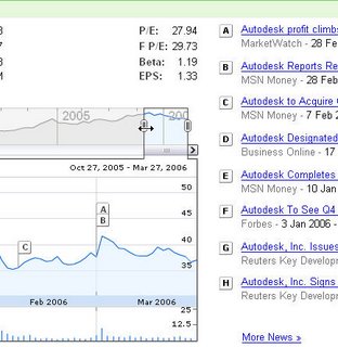
This is an new vis tool for showing stock performance correlated with news events: Google Finance (I pre-loaded my own company's data here). You can adjust the window you're seeing by size and location, and see the related stories associated with peaks and dips. It's kind of fun, although I wish they'd laid the page out a little nicer.

Labels: ,

Tuesday, February 14, 2006

The Dumpster (Happy Valentine's Day!)

Off Information Aesthetics, the Dumpster is a visualization of breakups described on blogs in 2005, with sample color commentary from the posts. It's very pretty, and of course it was made in processing.

Labels: ,

Thursday, February 02, 2006

The Snapshirts Blog Tag Cloud Meme

I don't know if 3 people count as meme-spreaders, but I got the Snapshirt blog cloud link off Jeff Mather who got it off someone else. I also wouldn't order the T-Shirt, but I like the cloud of terms it got off my site, so here it is.

One of the disadvantages of using blogger is that you can't tag entries, and therefore it's all one big soupy list that no one can find anything in (including me). I found another site somewhere that was offering a tag-cloud generation service for blogs, but when I tried it, it basically hung trying to do mine. Anyone have any further suggestions for how to do this easily in a useful (interactive) format for my own site? Drop me a note if so; I may hate flickr, but I like tags a fair bit.

Labels: ,

Sunday, December 25, 2005

Fashion Meets Processing

Clayton Cubitt shot A beautiful collaboration between fashion photographer Clayton Cubitt and and Processing generative artist Tom Carden: Metropop's denim issue.

Labels: , ,

Sunday, October 16, 2005

TextArc's text displays

TextArc is a rather stunning thing -- I can't tell how useful it is, but it sure is pretty to play with. To encourage you, here's the view of "Alice in Wonderland" as it's being crunched and cruised by me.

Labels:

isometricblocks, by ben fry

isometricblocks is a genome comparison visualization applet by Ben Fry, who is currently working local to me at the Broad Institute following his MIT PhD. He does wonderful, artistic visualizations. His Processingtoolkit for infovis apps, which I've blogged about before, just won an award at Ars Electronica.

Ben's dissertation is available online, which made me very excited just now when I found it: Computational Information Design.

Labels: , ,

Data Visualization: Best in Show

DMReview had a contest for best infovis application, and Jock Mackinlay's submission won. The scenario and data were not prescribed. The winning solution was a display of video game advertising strategies.

Jock is an alumnus of Xerox PARC, along with many of the world's best infovis HCI folks. He's now the UI Director at Tableau Software, a company I keep coming across. Jeff Heer, also formerly at PARC and main author of prefuse (which I've played with for network diagrams), was also at Tableau for a while. But I hit Tableau on the web-- knowing nothing of their distinguished staff-- when I was looking 6 months ago for companies doing interesting infovis and data mining applications. I thought their UI and featureset looked very nice.

Too bad they aren't posting more jobs for UI designers! (Although, they are located right down the road from my old Adobe digs in Seattle, and I know I can't take that climate.)

The DMreview article is especially good because it also shows some losers and why they lost, despite their slick design (like, immersive 3d virtual worlds for 2d graphics). I just wish it were longer.

Labels: , ,

Monday, August 15, 2005

Levitated | Jared Tarbell

Here's more interactive art from Jared Tarbell, of Complexification: Levitated.

Seriously, go now, and play. Try the walking insect generation or the walking things that change when you click on them or the gorgeous 3-d text space (I just wish it were infinite).

Labels: ,

Sunday, August 14, 2005

Color Words and Color Products

Two things made me think of each other today:

Martin Wattenberg has a fascinating look at the colors that lie behind the lexicon in his Color Code: A Color Portrait of the English Language. It's really fun to browse and mouse around, like most of Martin's work.

And this guy over on Flickr has Safeway aisles as color bars, abstractions of the colors of products in an American supermarket. They're surprisingly pretty.

Labels: ,

Saturday, August 13, 2005

Complexification

Complexification's Gallery is an awesome, hypnotic site. This is Jared Tarbell's art created by algorithms, and it can be drawn in real-time in front of you. As an unusual bonus, you can see the applet source code for the non-Flash ones. The software tool used to create the applets is Processing, an open-source visual and audio art programming language (which I will download after I finish playing with Tarbell's animations).

Update to add: There's some entertaining explanation of the simulations behind the art, especially the robot offspring one: Offspring is a visualization of the pair bonding process of a theoretical robot colony. Each robot is assembled, ages through youth, comes into a reproductive stage, and eventually dies of fatigue. If a robot is lucky enough to find a mate during it's reproductive stage, baby robots may be assembled.

offspring thumb

Labels: ,

Wednesday, August 03, 2005

The March of Pies: Gallery of Data Visualization

The Gallery of Data Visualization offers examples of good and bad statistical displays. The Have Something to Say category is especially amusing:
Blind Lemon Jefferson, the great blues musician, was once asked why there were so few white bluesmen. He replied, 'Knowin' all the words in the dictionary ain't goonna help if you got nuttin' to say.'

pie chart

This image, from the graphic design book Diagraphics II, attempts to show the relative market shares of Sotheby's vs. Christies over time. The graphic designer has cleverly used a variety of tricks to show.... What? Well, it does make clear that time is increasing over time. But there surely isn't much else going on.

Labels: , ,

Sunday, July 24, 2005

Moodgrapher: The London bombings

Livejournal lets users select a "mood" when they post an entry. While it's rarely very interesting at an individual post level, in aggregate, it becomes much more interesting. Check out the Moodgrapher: The London bombings, work by students at the University of Amsterdam.

Labels:

Thursday, July 07, 2005

Context Free Art

I'm entranced by this thing -- it's a context free grammar language and rendering environment for fractal-style art. It was inspired by the fake CS paper generator that used a small CFG (SCIgen) which was well-blogged. It's downright ingenious; I've been around context free grammars and text generation since my baby linguist days, but never seen them applied to making visuals.

context free tree picture

The language itself is a little bit like LOGO, which may or may not work for you (I want to read it like Prolog, alas). The app has a surprisingly elegant UI for grad student freeware, which makes it easy to play with the rules for generating the art and see immediate results from tinkering. It includes lots of examples along with a commented Lesson file.

Get it here: Context Free.

Labels:

Thursday, May 26, 2005

Artistic Visualizations by Amber Frid-Jimenez

Tom Erickson just pointed me at the beautiful work of Media Lab student Amber Frid-Jimenez, a visual designer doing interactive visualizations and art projects (she's also a print-based fine arts designer).

I especially recommend playing with the Contrail for the feeling it gives you, and it's worth checking out the challenging Document Icons, which is ambitious and possibly a little complex; but it's definitely pretty.

Labels: ,

Monday, May 23, 2005

Tokyo Picturesque

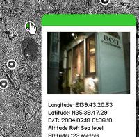
Wow, is this cool. It's another notch in the evolution of location-based photo apps; this time it comes with sound effects, too. (Gotten off Steve Cisler who got it off Steve Crandall.)
(Note: you don't need the language pack install to use it. Just say no.)

Labels:

Monday, May 02, 2005

InfoVis 2005 Contest

I'm impressed by InfoVis's contest. To encourage new visualisation techniques, they've got a contest challenge, complete with data set and questions to try to answer with your product solution. (This reminds me of the early days of speech and NLP research -- when shared datasets and competitive efforts combined with standard evaluation methods made for evolution in the field. You can't progress in a problem domain until you put some stakes in the ground, and get a lot of people working on precisely the same issue at the same time. And then evaluate those proposed solutions, by agreed upon criteria.)

This is the InfoVis 2005 Contest Call for Entries (due July 15); this is the description of the dataset and tasks for this year. For example:

1. Characterize correlations or other patterns among two or more variables in the data. For example:  
What products lead to growth in other products or industries? What contributes to companies moving, and what characterizes the moves?

2. Characterize clusters of products, industries, sales, regions, and/or companies. For example:  
What geographical areas developed in a similar manner or have similar characteristics? What product combinations tend to be produced by a company, or in a region?

Labels: ,

Visualizing Friendster

I've linked to the prefuse project a few times already. Danah Boyd and Jeffrey Heer have a paper they submitted to InfoViz (the conference) on using prefuse to build a network vis tool for Friendster users, and some frank evaluation of it. It includes a lot of nice screen shots.

Here is danah's link and notes about the project:   apophenia: Vizster. And here is the InfoViz paper link itself (pdf).

Labels: , ,

Saturday, April 30, 2005

Montage-a-Google

Gotten off tingilinde, the Montage-a-Google and the game based on it are pretty sweet.

This is my spring montage for "lilacs."

Other pretty ones are "apples", "leaves", "petals", "stars", and "trees."

Labels: , ,

A Web Design Process Animation

If you haven't seen this, it's strangely compelling: a guy captured stages of his design of a web page from start to end, and animated it, so you can see the process at many checkpoints. His explanation is at MBoffin.com, A Design Timeline. His animation is here.

This kind of thing would make for very nice portfolio material for anyone interviewing for a UI design job. One is supposed to be able to show stages of development and talk to them. Without a little more "documentation" of what's going on, it's not quite sufficient as is. But for supporting material in a website resume, for example, it would be pretty cool.

Labels: ,

Saturday, April 16, 2005

BlogPulse Trends, Memes, Trackers

Infoseek's BlogPulse has some tools to watch the memes and activity on the blogosphere. There are a handful that are of direct interest to me, in my attempt to analyse meme spread on LiveJournal.

The Conversation Tracker: Another in the collection of tools to show threaded conversations, this time at the meta-level, across sites. While very difficult to do in the general wide open system of the Internet, tracking topic spread and threads is far, far simpler in relatively closed systems like Usenet (see Marc Smith's Netscan stuff, of course) and LiveJournal. I'd like to see more tools for handling LiveJournal's sprawling disaster of a conversation space.... Now THAT would really benefit a lot of users who are frustrated, and with good reason. (Difficulty following conversation across LJ's was one of the major issues raised by users in my survey results, which I'll digest and post sometime in the next month.)

The Trend Tool: Their tool for simple graphs of topic spread over time. What can I say, I love graphs, especially time series data. I haven't played with it enough to know what I think of it as a general purpose tool, though.

HP Labs Empidemic Analyser: Yevgeniy Medynskiy of Cornell pointed me to the HP Labs work on meme spread, which seems to be evolving into some cool tools. Their thesis is that viral memes and topic memes spread similarly. I'm going off to play with this thing now.

For all these links: BlogPulse Tools, scroll down for the items in question.

Labels: ,